Building maps that are rich in data and also easy to interpret is an incredibly hard task. The map-maker must keep in mind the needs of their audience and cater the projection, coloration, shading, labeling, and more so that the map can be grasped intuitively.
If you’re anything like me, you probably got a full year’s dosage of maps thrown up on big touchscreens at the start of this month as part of the 2020 Presidential Election. Unfortunately for us all, the most common map we were all looking at is objectively, with all due respect, a pretty bad map. You know, this guy?

While very easy to use for state-level win vs loss calls, this type of map shows depressingly little data about what’s actually happening across the country. In particular, there is no margin of victory visible and electoral vote weightings aren’t incorporated at all. These effects combine to create a map which is actually quite misleading as a formal scoreboard, as the human eye defaults to comparing the area taken up by each color on the map, arriving at the totally reasonable conclusion that red must be winning or darn close because there’s an awful lot of it in the middle there!
Now, sophisticated readers that you are, you probably know that we have to a bit of mental discounting of the red area on this map, and that margin of victory and electoral votes at stake a crucial to the full picture. In this respect - I completely agree! However, that jump isn’t necessarily immediately intuitive to a lot of folks, and absent that second level of consideration, many people simply see this single map, without any nuance, as their primary source of electoral information.
Shouldn’t there be a better, a more intuitive way of visualizing this data, which leads everyone to a more accurate and sophisticated understanding of how the election played out?!?
With this in mind, let’s walk through how we go from the chart above to something a bit better, and talk about how each type of map changes our perceptions.
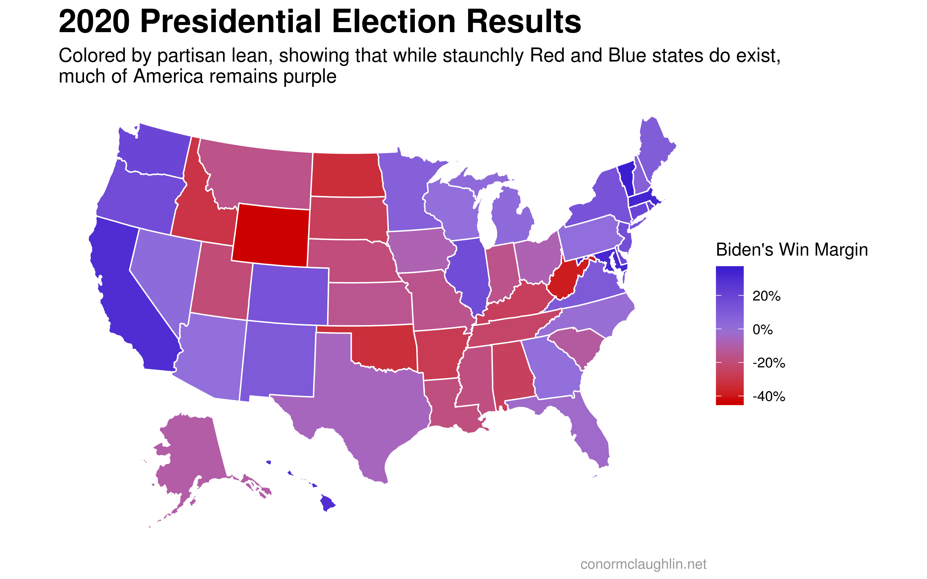
The Purple States of America
The first, and probably most important, thing we can do is change the way our map is colored. By changing from a binary scale (R/D) to a gradient scale (Democratic margin %), we get a much more informative picture of results across states, which can be compared directly. While there are certainly a handful of states which voted overwhelmingly for one party or another (such as Wyoming, Vermont, Oklahoma, and California), many states are still quite competitive.
Statebins and Hex Maps
The second thing we can do to improve our maps is to play with the size of states being represented.
One issue that we know American electoral maps struggle with is the disconnect between land area and population. On the coasts, this is generally a non-issue, but in the Mountain West, huge swathes of land make up not-very-many electoral votes, as there just aren’t that many folks living out there!
So, to minimize the visual impact of a big red state like Wyoming (less people than Rhode Island or the District of Columbia), one thing we can do is standardize the size and appearance of each state. With the “size” variable controlled, it’s easier to interpret the results across the country, without the bias of empty land.
Below are two examples of standard-size maps, the first represented by “state bins”, and the second by a hexmap.

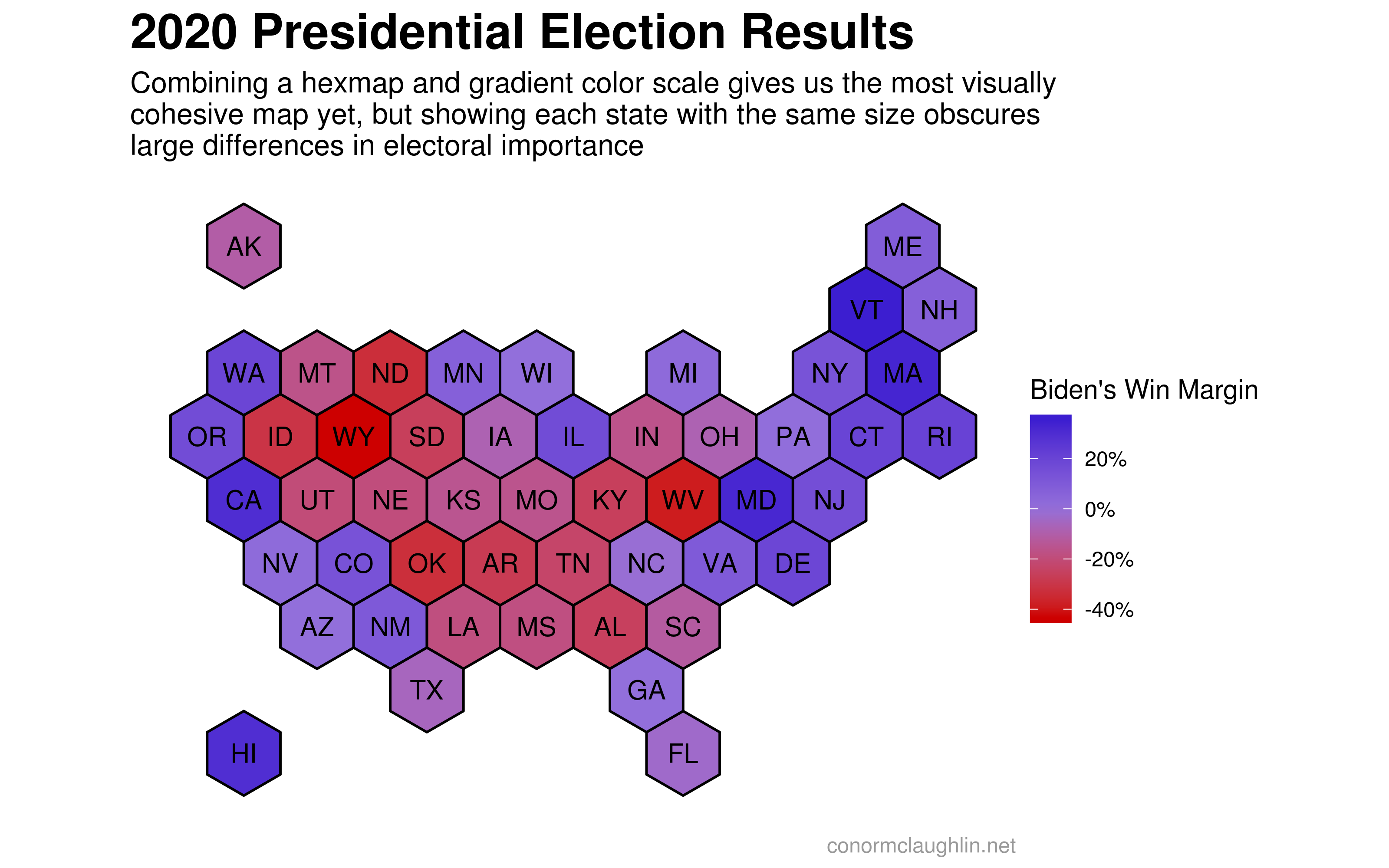
I’d like to give a shoutout to hrbrmstr for putting together the statebins package for R which greatly simplifies the process of building these charts by snapping right into ggplot as a native geom.
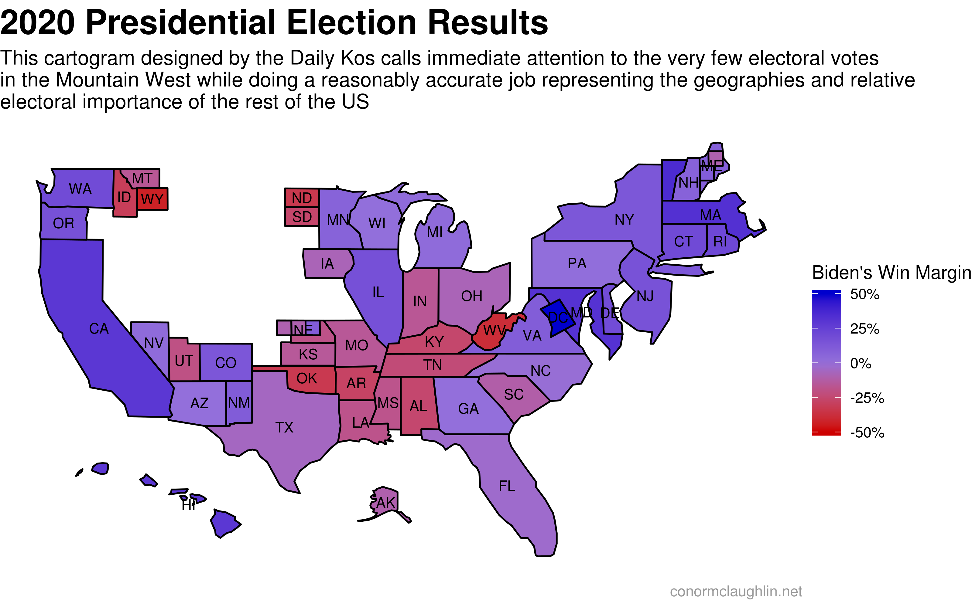
Cartograms
While controlling for state size can be helpful in certain ways, it’s also very true that in many respects we don’t actually want a level “visual” playing field between states! Instead, we want something that is scaled by the relevant metric, which in the case of this election is electoral votes, rather than land area.
Cartograms are an interesting form to investigate to help solve this issue - these are essentially maps where each geographic forms are sized according to a target variable. For this election, we can scale each geography by electoral votes per state, so that the combination of size (a proxy for importance) and shade (for margin of victory) can convey a large amount of information with just a brief look.

Tilegrams
Cool as they are, cartograms can be a bit tricky to interpret if the sizes of any particular states warp to a significant degree, throwing off our intuitive understanding of the geography.
Tilegrams are another approach to solving the size problem, as they represent each electoral vote as a tile, but form one continuous mass. Furthermore, tilegrams are typically laid out quite artfully so that they are still close enough to a “normal” map layout. If you wanted to think of them as effectively hexbin cartograms, that’s pretty much what they are!
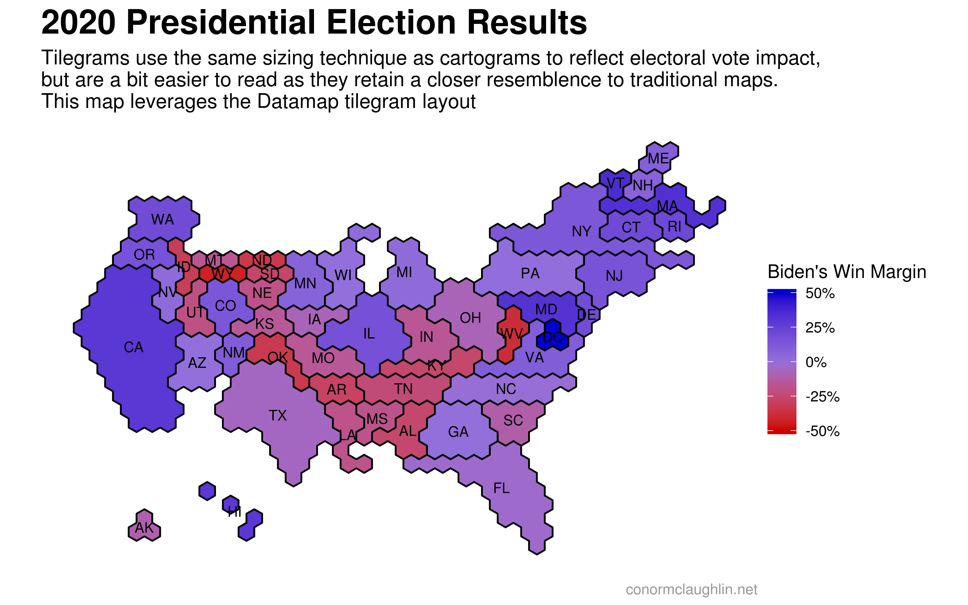


I want to give a huge shoutout to Pitch Interactive putting many of these tilegram layouts together, and bhaskarvk for making them accessible as sf objects in R - I wouldn’t have been able to put these maps together without the tilegramsR package!
In Conclusion
As mentioned earlier, making good maps is incredibly hard! While I don’t think anything I’ve laid out above is particularly masterful, hopefully it was a fun exercise to explore some different charting techniques and to think about how people interpret them differently.
Moving forward, once county-level electoral results are publicly available, I’m super excited to make some election maps at a higher resolution, and using some different techniques. I think this map was one of the very best of the 2016 election, and will be excited to create a similar one in either R or Python with the 2020 data!