In the leadup to Opening Day, Fangraphs published a series of “Positional Power Rankings”, which sought to measure how each team’s roster stacks up against others in the league, at each position.
The final rankings were computed two ways:
- Creating an ordinal list of teams, sorted by projected WAR at that position (ie. 1, 4, 12)
- Creating a z-score for projected WAR at each position (ie. +2.35, -0.76)
While method one is handy to quickly check relative position in the rankings, it doesn’t do a very good job of capturing how significant the differences are… For example, Juan Soto isn’t just the best right fielder, he is projected to be a lot better than the second best right fielder. As such, visualizing this data with z-scores of projected WAR gives us a more intuitive sense of the spread of the data, in addition to the ordinal rankings.
In Fangraphs’ article, I loved that they used this same approach - in my opinion, they just whiffed on the final visualization of the information! Presenting the data in a simple table means there are hundreds of datapoints available, and each one needs to be mentally processed to extract meaning - which human’s brains are not built to do.
Instead, we can simply turn this data into a heatmap with a diverging color palette, which allows our brains to immediately key in on the notable datapoints (both good and bad), and makes it much easier to compare teams against each other, through the distribution of hue.
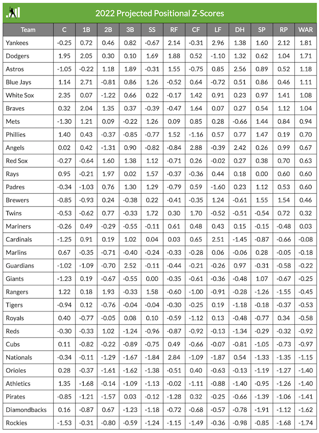
Before: Fangraphs’ Table
After: Heatmap Visualization

Takeaways from the Data
Some thoughts after reading through the data and thinking through what it shows us about the league…
- Particularly well-rounded lineups seem to be the Blue Jays, Dodgers, Yankees, and White Sox - all of which show up in the top six of the Vegas odds to win the World Series
- A few “duos” really pop in the projections:
- Angels CF and DH: Trout and Ohtani
- Rangers 2B and SS: Semien and Seager
- Rays 2B and SS: Lowe and Franco
- Yankees RF and LF: Judge and Gallo
- Gallo’s projection seems overly generous to me - but I think it’s more of a product of left field being a “weak” position across the league than anything else (though the short porch in right at Yankee Stadium definitely helps)
- As such, given that these z-scores show how many standard deviations a given number is above the mean, Gallo’s WAR projection looks particularly good against the relatively low baseline for average left fielder performance
- Two pitching staffs stick out in particular, with the Brewers and the Yankees both possessing strong starting rotations and quality bullpens to boot
- There are a few teams where the clear star on each roster pops out:
- Cardinals: LF, Tyler O’Neill
- Similar to Gallo, O’Neill seems to benefit positionally from LF having a week average performance baseline
- Guardians: 3B, Jose Ramirez
- Nationals: RF, Juan Soto
- Cardinals: LF, Tyler O’Neill
Code to Replicate the Heatmap
library(tidyverse)
library(reshape2)
library(rcartocolor)

z_scores %>%
  select("Team", "C", "1B", "2B", "SS", "3B", "RF", "CF", "LF", "DH", "SP", "RP") %>%
  melt() %>%
  ggplot(aes(x = variable, y = Team, label = round(value, 2), fill = value)) +
    geom_tile(color = "white") +
    geom_text(size = 2.4) +
    scale_fill_gradient2(
      low = carto_pal(5, "TealRose")[5],
      mid = carto_pal(7, "TealRose")[4],
      high = carto_pal(7, "TealRose")[1],
      midpoint = 0,
      name = "Positional WAR\nz-score"
    ) +
    scale_y_discrete(limits = rev) +
    scale_x_discrete(position="top") +
    coord_fixed(0.5) +
    theme_minimal() +
    theme(
      panel.grid.minor.y = element_blank(),
      panel.grid.major.x = element_blank(),
      panel.grid.minor.x = element_blank(),
      plot.title = element_text(size = 20, face = "bold"),
      plot.subtitle = element_text(size = 12),
      plot.caption = element_text(colour = "grey60", margin = margin(t = 10)),
      legend.position = "right"
    ) +
    labs(
      x = "",
      y = "",
      title = "Comparing Positional WAR Projections",
      subtitle = "Data shows the z-score of projected WAR by position for the 2022 season.\nZero represents league average for the position, and values are the number\nof standard deviations above or below",
      caption = "Source data published by Fangraphs and reused here to better visualize the data\nconormclaughlin.net"
    )