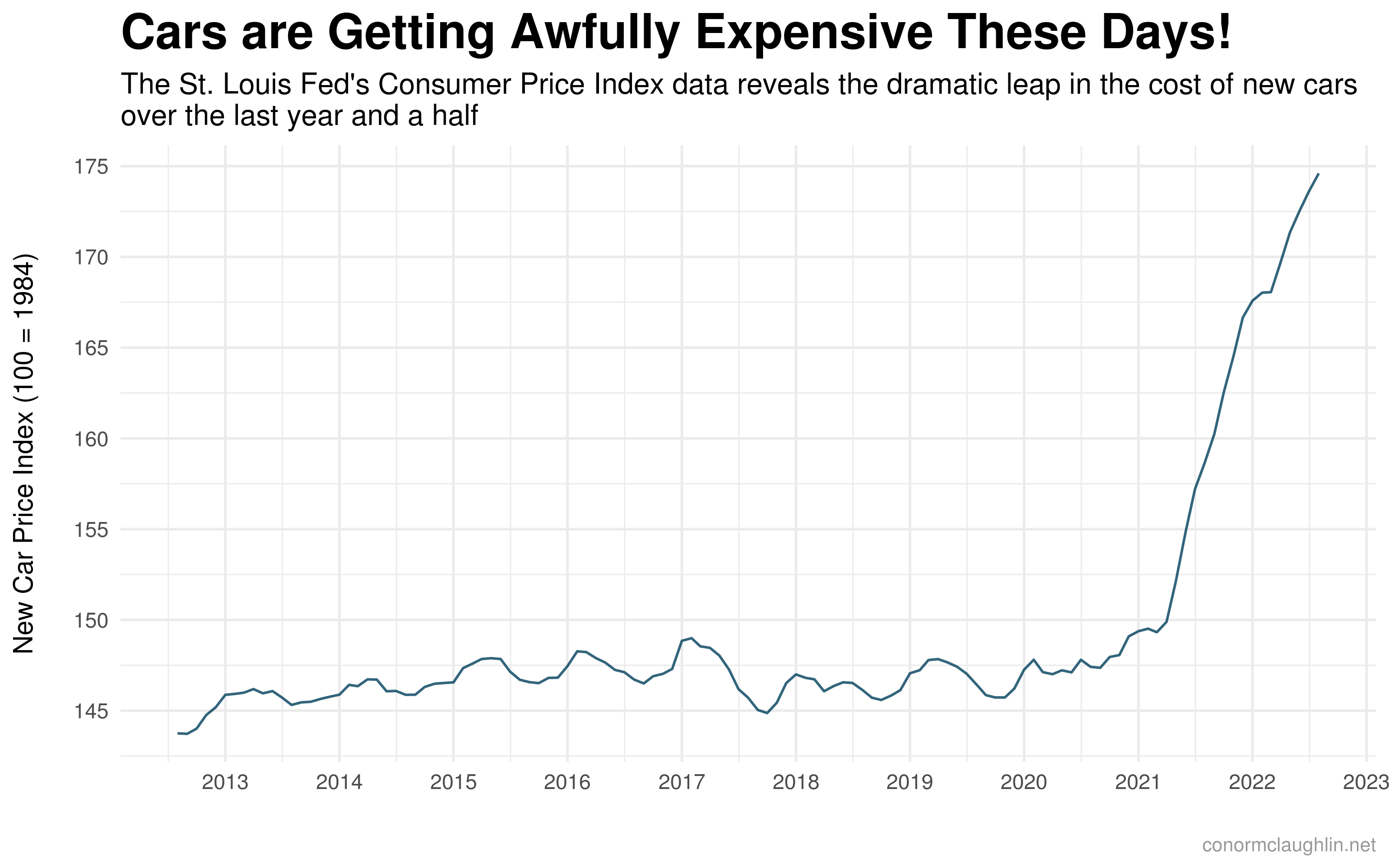
Over the past year and a half, new cars have become dramatically more expensive. While changes in product mix, constraints in part supplies, and overall increases in quality have played into that, dealer markups have also become a prominent factor - especially with highly-demanded models.
Economic Background
With exciting cars like the Ford Bronco and new Corvette having hit the market, dealers have found themselves in an interesting position - sole vendors of an in-demand good, with limited supply. It doesn’t take an Econ major to see the outcome here -> dealers have been able to apply “market adjustment” fees on top of MSRP (crucially - which enough people will still pay!) to maximize their earnings per sale, much to the chagrin of their OEMs.
Getting Data to Analyze
To help us understand the scale of this trend, we can use data from Markups.org, a site that crowdsources dealer pricing from prospective car purchasers. After scraping all of the submissions on the site I could find, I was left with about 5,400 records to make sense of.
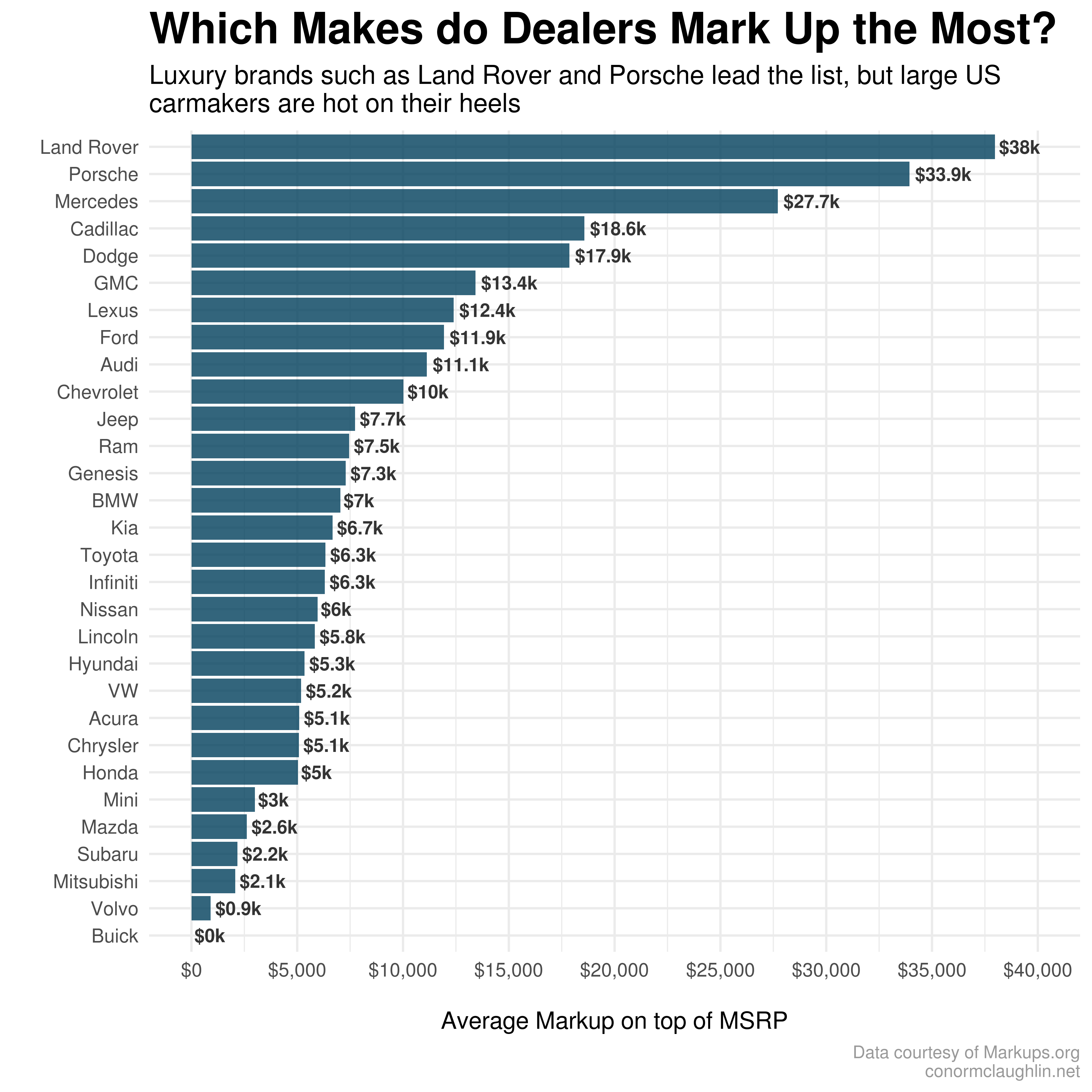
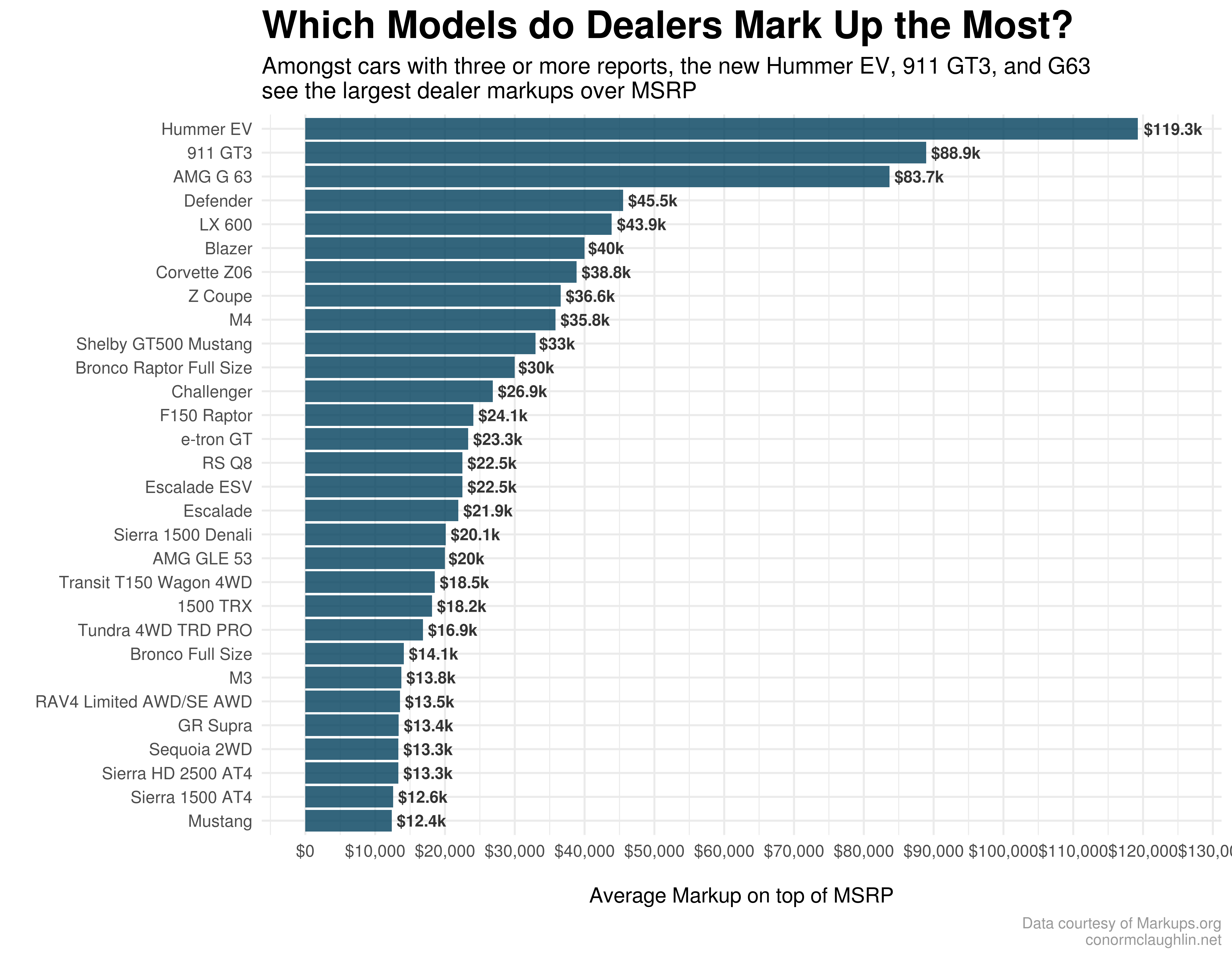
It’ll be no surprise to frequent readers of this blog that I immediately wanted to build visuals of the primary rollups of the data - so I went ahead and looked specifically at which models and makes have received the A) highest volume of markup reports, and B) highest dollar value of markups on average.
Take a look at the findings below, and keep in mind that there is definitely a significant bias in what random consumers choose to submit or not submit to Markups.org, so these trends should be taken directionally!
Visualizations

Code Resources
Fetch Markups.org Site
import requests
import pandas as pd
import requests

def fetch_results(page):
  base_url = "https://markups.org/all?items_per_page=100&page=%s" % page
  r = requests.get(base_url)
  return r.content
Grab Listing Info from Each Page
from bs4 import BeautifulSoup

def get_listings(page):
  soup = BeautifulSoup(fetch_results(page), 'html.parser')
  divs = soup.find_all("div", {"class" : "tw-flex tw-flex-wrap"})
  rows = []
  for div in divs:
    temp = []
    for string in div.stripped_strings:
      if string == 'Dealer Name:' or string == 'Markup:' or string == 'Location:' or string == 'Year':
        pass
      else:
        temp.append(string.replace(': ', ''))
    if len(temp) == 6:
      rows.append(temp)
  return rows
Build Dataframe of Listings
data = []

for i in range(1, 55):
  data += get_listings(i)

df = pd.DataFrame(data, columns = ['dealer', 'price', 'state', 'year', 'make', 'model'])
Example of ggplot Visualization
library(scales)
library(tidyverse)

by_model %>%
  filter(count >= 3) %>%
  head(30) %>%
  slice_max(avg_markup, n = 10) %>%
  ggplot(aes(x = reorder(model, avg_markup), y = avg_markup, label = paste("$", round(avg_markup / 1000, 1), "k", sep = ""))) +
    geom_col(fill = '#003f5c', alpha = 0.8) +
    geom_text(hjust = -0.1, size = 3, fontface = "bold", color = "grey20") +
    coord_flip() +
    scale_y_continuous(labels=scales::dollar_format(), breaks = pretty_breaks(n = 10), limits = c(0, 125000)) +
    theme_minimal() +
    theme(
      plot.title = element_text(size = 20, face = "bold"),
      plot.subtitle = element_text(size = 12),
      plot.caption = element_text(size = 8, colour = "grey60")
    ) +
    labs(
      title = "Which Models do Dealers Mark Up the Most?",
      subtitle = "Amidst cars with three or more reports, the new Hummer EV, 911 GT3, and G63\nsee the largest dealer markups over MSRP",
      x = "",
      y = "\nAverage Markup on top of MSRP",
      caption = "Data courtesy of Markups.org\nconormclaughlin.net"
    )