Years ago, I set up a Pi-hole at my house to serve as a network-level adblocker for all my devices. It’s been a terrific setup - the Pi-hole is quietly super effective at removing advertisements from different services, to the point where it can be surprising to load a website away from home and see how many ads are layered on the page!
A few days ago, I got curious to see if I could get any quantitative metrics on the performance of the Pi-hole, to augment my qualitative judgement.
It quickly became evident to me that the Pi-hole’s online interface is tailored towards recent metrics, with only a few simple visuals presented to users. While these look great at first glance, they don’t go particularly deep into the actual performance of the system. Further investigation revealed that while it’s possible to see things like query volume over the past year, the figures are only shown as totals and cannot be split by clients.

Analyzing Long-term Pi-hole Data
Clearly, we needed to figure out a way to dig deeper into the Pi-hole’s data. Fortunately for us, the software does store a larger and more complete record of its data in a SQLite database! By default, that database logs the last 365 days of data, on a rolling basis, and is stored on-device at the path /etc/pihole/pihole-FTL.db
Exporting Long-term Pi-hole Data
The database can be easily pulled off the Pi using SCP, which essentially performs a combined SSH login + copy operation. You’ll need to tweak the parameters to match your setup, but the command should look something like the following:
scp -v pi@raspberrypi:/etc/pihole/pihole-FTL.db /tmp
Query Using SQL via R
Once you have the database exported, you can really use any tool you like to analyze the data. Since I love using ggplot2 to make charts, and R has libraries which allow SQL to be run and easily exported as dataframes, I chose to perform my analytics using R.
The code below uses the RSQLite package to connect to the pihole-FTL.db that we exported earlier, and prints out the list of tables contained in the database.
library(RSQLite)
conn <- dbConnect(RSQLite::SQLite(), "pihole-FTL.db")
dbListTables(conn)
To get a dataframe of request volume by client and status, we can do a quick rollup of the data with a SQL query.
query = "
SELECT
  client
  , status
  , COUNT(1) as queries
  , SUM(COUNT(1)) OVER (PARTITION BY client) as total_queries
  , CAST(COUNT(1) AS DOUBLE) / SUM(COUNT(1)) OVER (PARTITION BY client) as pct_total_queries
FROM queries
GROUP BY 1,2
ORDER BY total_queries DESC, queries DESC
"

queries_by_client_status <- dbGetQuery(conn, query)

queries_by_client_status
Visualizations
While the data doesn’t show any particularly crazy insights, it is pretty interesting to see two trends in particular:
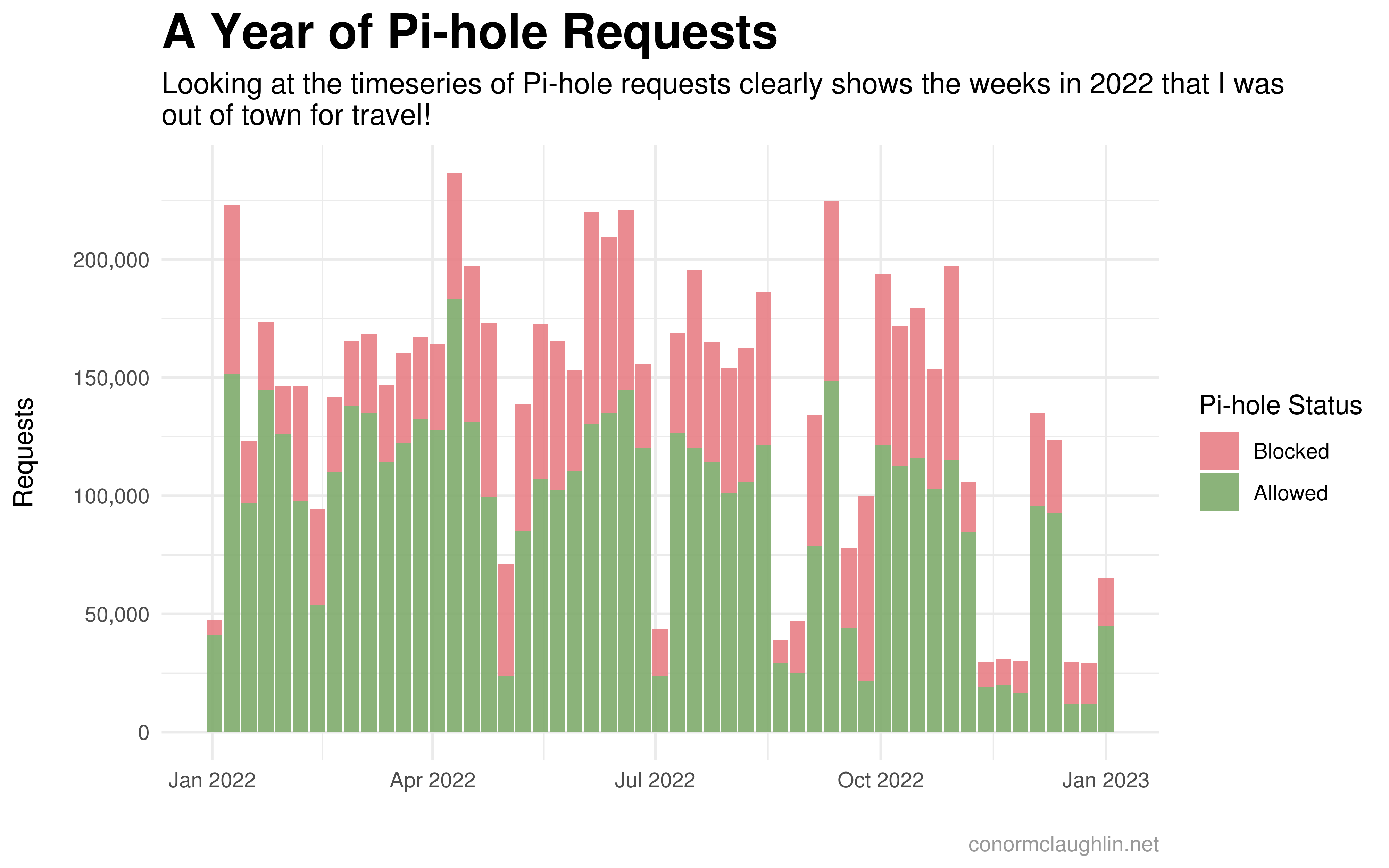
- The volume of queries made to the Pi-hole (aka network requests) is super responsive to the periods of time I spent away from home in 2022 -> with sharp declines in volume matching my periods of travel
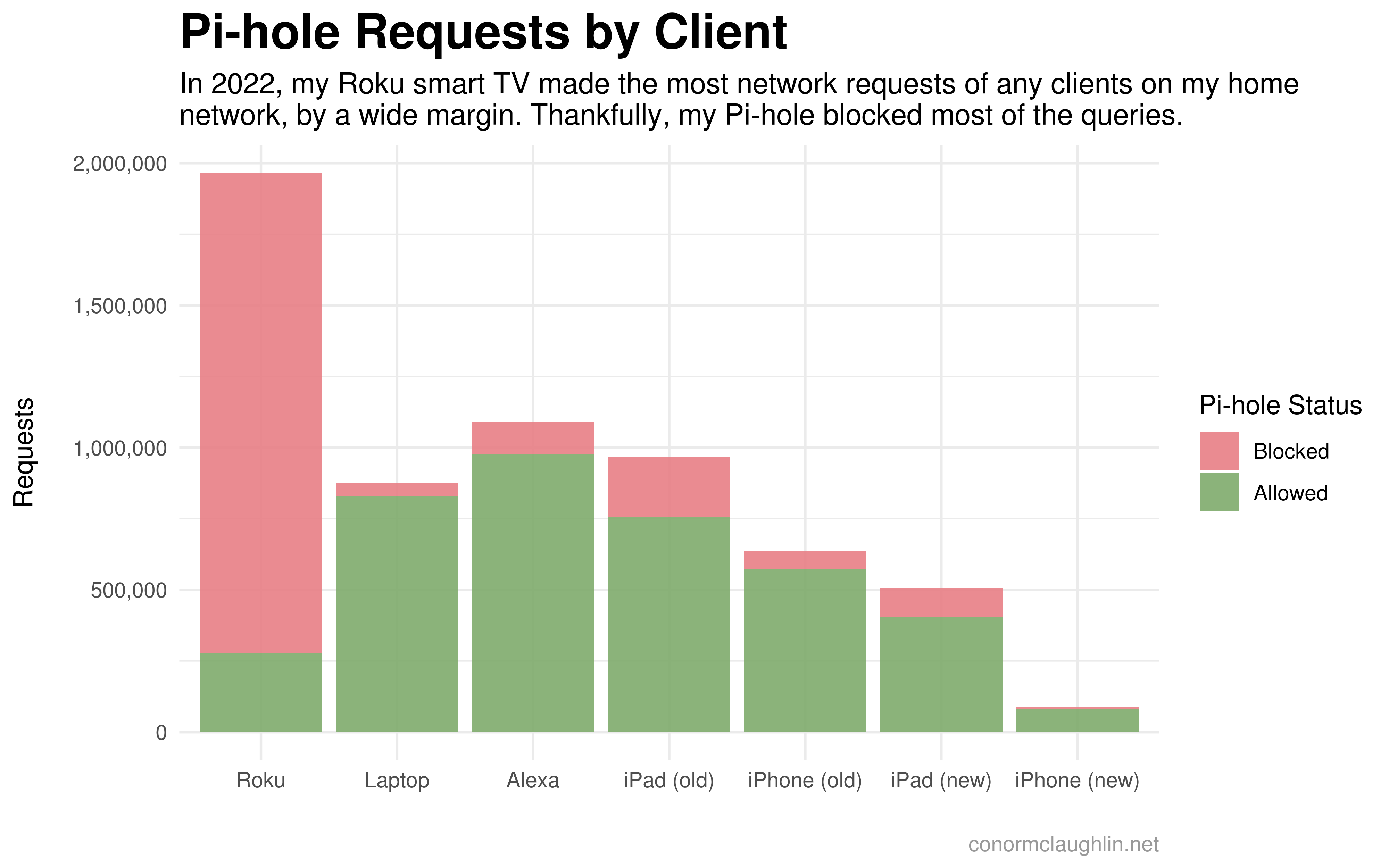
- A tremendous amount of network traffic comes from my Roku smart TV! I generally don’t watch too much TV, so I think this figure really speaks to how much is happening behind-the-scenes in the software of modern smart TVs. I suspect my Roku is constantly trying to load ads to display on the home screen, and reporting back to “home base” on my device usage… Thankfully, it seems that the bulk of these requests are blocked by my Pi-hole 🙏
Timeseries

Requests by Client

Visualization Code
Timeseries
library(lubridate)

merge(x = daily_timeseries, y = status_mappings, by.x = 'status', by.y = 'id') %>%
  mutate(week = floor_date(ymd(dt), unit = "week")) %>%
  ggplot(aes(x = week, y = queries, fill = approved)) +
    geom_col(alpha = 0.9) +
    scale_fill_manual(values = c("no" = "#e77e85", "yes" = "#7fab6c"), labels = c("no" = "Blocked", "yes" = "Allowed"), name = "Pi-hole Status") +
    scale_y_continuous(labels = label_number(big.mark = ",")) +
    theme_minimal() +
    theme(
      strip.background = element_rect(fill = "grey30"),
      strip.text = element_text(color = "grey97", face = "bold"),
      plot.title = element_text(size = 20, face = "bold"),
      plot.subtitle = element_text(size = 12),
      plot.caption = element_text(colour = "grey60")
    ) +
    labs(
      x = "",
      y = "Requests\n",
      title =  "A Year of Pi-hole Requests",
      subtitle = "Looking at the timeseries of Pi-hole requests clearly shows the weeks in 2022 that I was\nout of town for travel!",
      caption = "conormclaughlin.net"
    )
Requests by Client
library(tidyverse)
library(scales)

merge(x = merge(x = queries_by_client_status, y = client_mappings, by.x = 'client', by.y = 'client'), y = status_mappings, by.x = 'status', by.y = 'id') %>%
  ggplot(aes(x = reorder(device, -queries), y = queries, fill = approved)) +
    geom_col(alpha = 0.9) +
    scale_fill_manual(values = c("no" = "#e77e85", "yes" = "#7fab6c"), labels = c("no" = "Blocked", "yes" = "Allowed"), name = "Pi-hole Status") +
    scale_y_continuous(labels = label_number(big.mark = ",")) +
    theme_minimal() +
    theme(
      strip.background = element_rect(fill = "grey30"),
      strip.text = element_text(color = "grey97", face = "bold"),
      plot.title = element_text(size = 20, face = "bold"),
      plot.subtitle = element_text(size = 12),
      plot.caption = element_text(colour = "grey60")
    ) +
    labs(
      x = "",
      y = "Requests\n",
      title =  "Pi-hole Requests by Client",
      subtitle = paste("In 2022, my Roku smart TV made the most network requests of any clients on my home\nnetwork, by a wide margin. Thankfully, my Pi-hole blocked most of the queries."),
      caption = "conormclaughlin.net"
    )