Earlier this week, I came across an analysis with some interesting data and takeaways, but one of the worst data visualizations I’ve seen in a long, long time.
After some very careful study, I was able to make out that openness to purchasing an electric vehicle (EV) or hybrid surged in 2021, but has stagnated in 2022 and 2023. However, the chart is so unintuitive that it’s hard to quickly come to that conclusion - I can’t actually believe a big company like S&P Global Mobility would publish something like this!
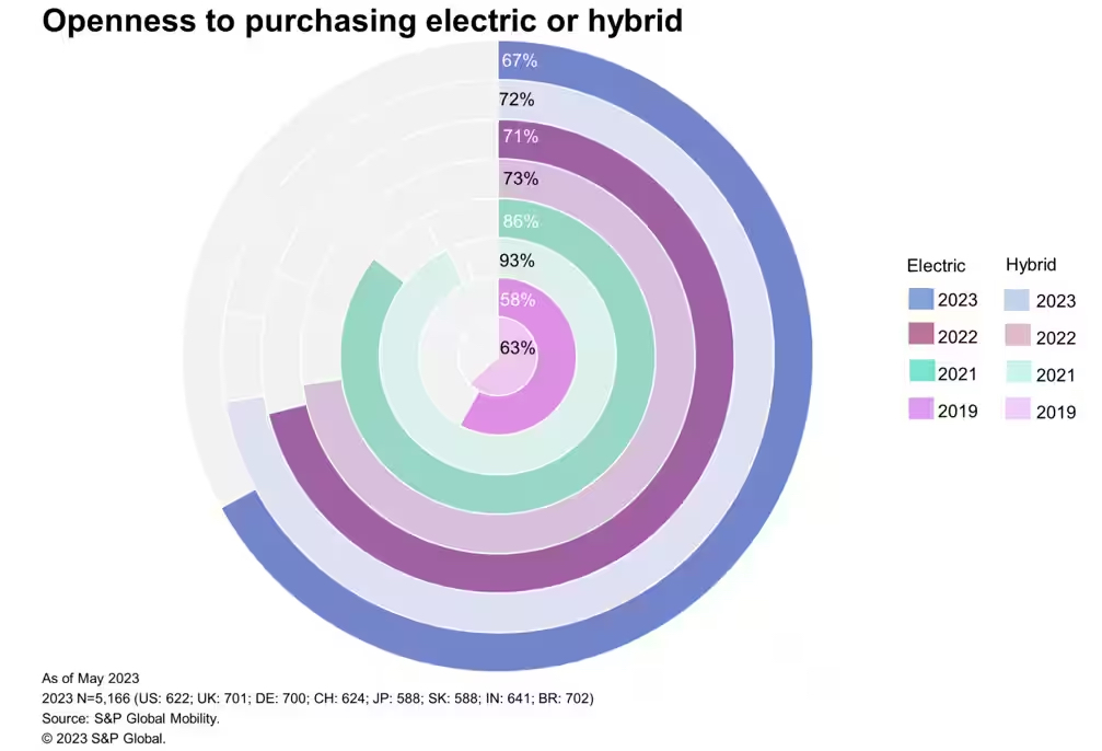
Why Tufte Would Agree This Chart Stinks
This chart violates a number of core principles of graphical integrity, laid out by Edward Tufte in his magnum opus “The Visual Display of Quantitative Information”.
Key among these are:
- Show the Data: Tufte’s stance is that visual embellishments detract from the reader’s interpretation of the data. In this case, it’s absolutely true that the chart layout inhibits intuitive understanding of the measures being shown with the dark and light colors representing type of model and year, data presented non-linearly, etc.
- Maximize Data-Ink Ratio: Tufte suggests that designers reduce the number of non-data features shown on the chart, so that maximal focus can be placed on the key data in question. In this case, the two sets of legends and busy caption are prime distractors, and the circular bar chart has redundant data labels which are not placed in a location to be easily read in conjunction with the size of the bar
- Maximize Data Density: Tufte suggests conveying the information being shown in the smallest, but most consistent, space possible. That is obviously not done in this data, where the designer clearly wanted to jam a circular bar chart in at all costs
Offering Improved Alternatives
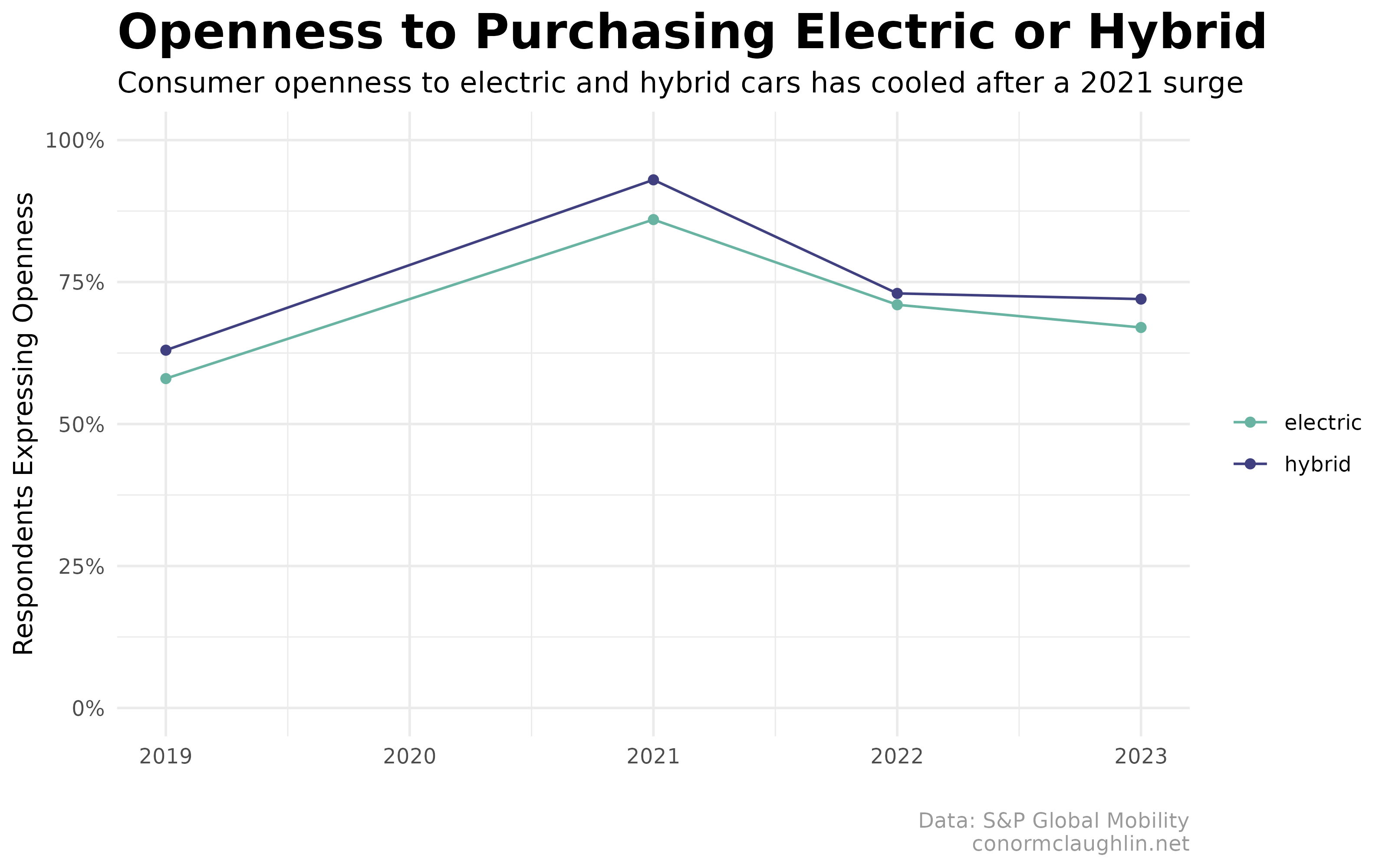
Naturally, I couldn’t relax until I made an improved version of this chart. Let’s look at three options I cooked up, and think about which conveys the data most clearly, while trying to adhere to Tufte’s graphical design principles.
Line Trend Chart
Transforming the base data into a line chart makes the data much more interpretable, right off the bat. However, it also highlights the awkward gap in survey data in 2020 (due to COVID, I’m sure), which makes the proportions of the data look a little funny.
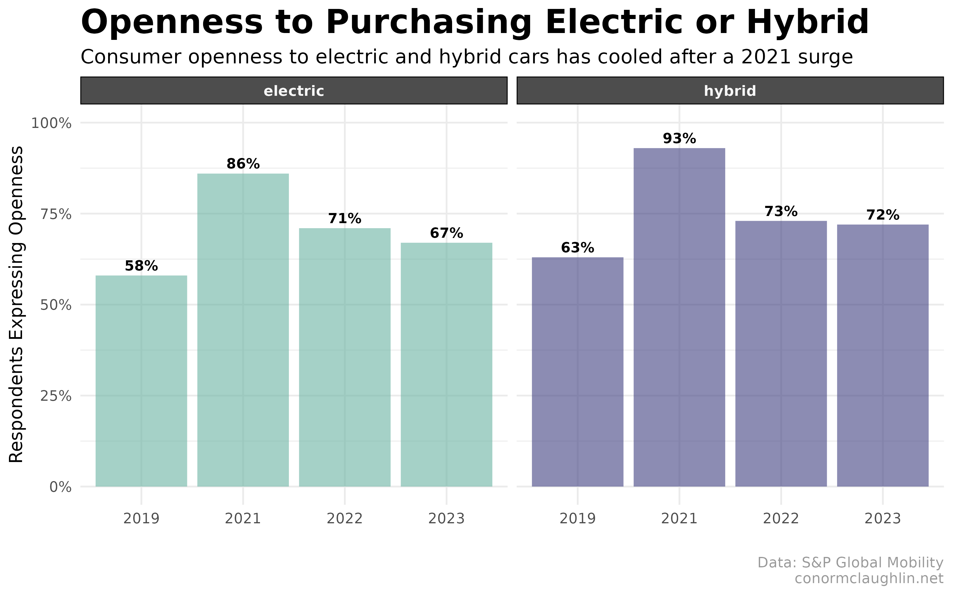
Faceted Bar Chart
Showing the data as a faceted bar chart, really just two small multiples side-by-side, shows the data trends very clearly, while also making the “missing” 2020 issue go away, as the x-axis labels are interpreted discretely, rather than as a timeseries.
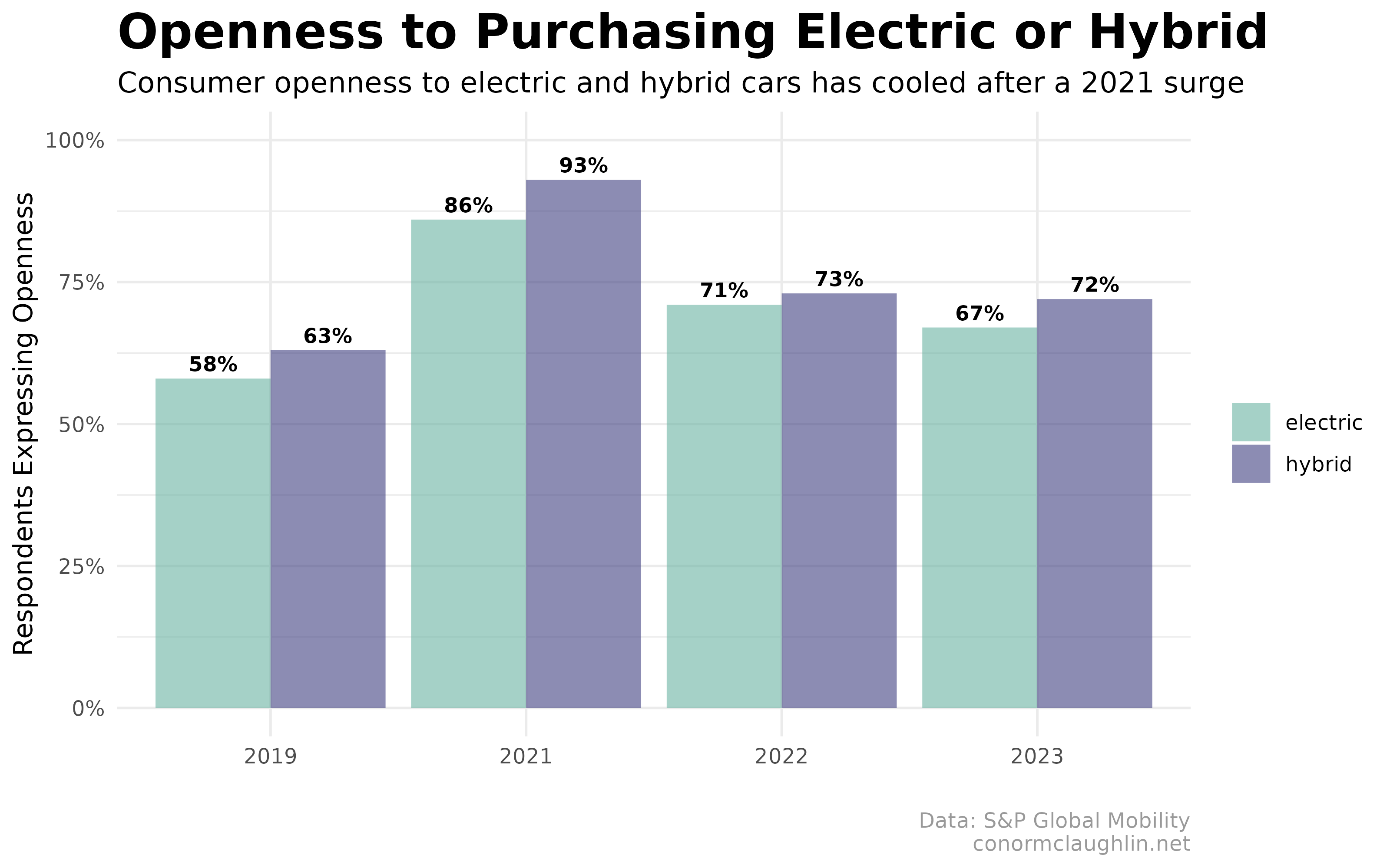
Grouped Bar Chart
Showing the data as a grouped bar chart helps show the absolute change in the data, while allowing for slightly better comparisons between the two data series than with the faceted plots.
In particular, this version of the chart makes it easier to see that in 2023, there was a bit of dispersion between electric and hybrid vehicles - where hybrid vehicles became relatively more popular among consumers than in 2022.
Code
library(tidyverse)

df <- data.frame(
  year = c(2019, 2021, 2022, 2023, 2019, 2021, 2022, 2023),
  kind = c("electric", "electric", "electric", "electric", "hybrid", "hybrid", "hybrid", "hybrid"),
  value = c(58, 86, 71, 67, 63, 93, 73, 72)
)
Line Trend Chart
df %>%
  ggplot(aes(x = year, y = value / 100, group = kind, color = kind)) +
    geom_line() +
    geom_point() +
    scale_color_manual(values = c("#69b3a2", "#404080"), name = "") +
    scale_y_continuous(labels = scales::percent_format()) +
    expand_limits(y = c(0,1)) +
    theme_minimal() +
    theme(
      strip.background = element_rect(fill = "grey30"),
      strip.text = element_text(color = "grey97", face = "bold"),
      legend.background = element_rect(color = NA),
      plot.title = element_text(size = 20, face = "bold"),
      plot.subtitle = element_text(size = 12),
      plot.caption = element_text(colour = "grey60")
    ) +
    labs(
      x = "",
      y = "Respondents Expressing Openness",
      title =  "Openness to Purchasing Electric or Hybrid",
      subtitle = "Consumer openness to electric and hybrid cars has declined after a 2021 surge",
      caption = "Data: S&P Global Mobility\nconormclaughlin.net"
    )
Faceted Bar Chart
df %>%
  ggplot(aes(x = as.factor(year), y = value / 100, group = kind, fill = kind, label = paste0(value, "%") )) +
    facet_wrap(~ kind) +
    geom_col(position = position_dodge(), alpha = 0.6) +
    scale_fill_manual(values = c("#69b3a2", "#404080"), name = "", guide = "none") +
    geom_text(
      position = position_dodge(width = 0.9),
      vjust = -0.5,
      fontface = "bold",
      size = 3
    ) +
    expand_limits(y = c(0,1)) +
    scale_y_continuous(labels = scales::percent_format()) +
    theme_minimal() +
    theme(
      strip.background = element_rect(fill = "grey30"),
      strip.text = element_text(color = "grey97", face = "bold"),
      legend.background = element_rect(color = NA),
      plot.title = element_text(size = 20, face = "bold"),
      plot.subtitle = element_text(size = 12),
      plot.caption = element_text(colour = "grey60")
    ) +
    labs(
      x = "",
      y = "Respondents Expressing Openness",
      title =  "Openness to Purchasing Electric or Hybrid",
      subtitle = "Consumer openness to electric and hybrid cars has declined after a 2021 surge",
      caption = "Data: S&P Global Mobility\nconormclaughlin.net"
    )
Grouped Bar Chart
df %>%
  ggplot(aes(x = as.factor(year), y = value / 100, group = kind, fill = kind, label = paste0(value, "%") )) +
    geom_col(position = position_dodge(), alpha = 0.6) +
    scale_fill_manual(values = c("#69b3a2", "#404080"), name = "") +
    geom_text(
      position = position_dodge(width = 0.9),
      vjust = -0.5,
      fontface = "bold",
      size = 3
    ) +
    expand_limits(y = c(0,1)) +
    scale_y_continuous(labels = scales::percent_format()) +
    theme_minimal() +
    theme(
      strip.background = element_rect(fill = "grey30"),
      strip.text = element_text(color = "grey97", face = "bold"),
      legend.background = element_rect(color = NA),
      plot.title = element_text(size = 20, face = "bold"),
      plot.subtitle = element_text(size = 12),
      plot.caption = element_text(colour = "grey60")
    ) +
    labs(
      x = "",
      y = "Respondents Expressing Openness",
      title =  "Openness to Purchasing Electric or Hybrid",
      subtitle = "Consumer openness to electric and hybrid cars has declined after a 2021 surge",
      caption = "Data: S&P Global Mobility\nconormclaughlin.net"
    )