Most fantasy football leagues have a notion of “start percentage” for players - as ESPN says, “start percentage shows the number of fantasy leagues a player is started in divided by the number of leagues he is eligible in. This helps indicate how the public views a player.”
Watching football last weekend, I was struck by the number of touchdowns being scored by users who I knew weren’t being started! Particularly in the Broncos vs Chargers matchup, it seemed like the players who might have been “broadly started” in fantasy (like Courtland Sutton and Ladd McConkey) did very little, while the following fantasy-unknowns all grabbed receiving scores: DeVaughn Vele, Michael Burton, Hassan Haskins, and Derius Davis.
Following this thread, I wanted to get a better sense of the phenomenon and see if certain teams really do have a meaningful fraction of their offense coming from fantasy-irrelevant players! And conversely, which teams tend to have most of their scoring concentrated amongst highly-started players.
Data Gathering
To accomplish this, I needed to acquire per-player, per-week data on start rates. A subset of this data is exposed in most online fantasy league UIs, but my analysis requires figures for all players in all weeks, so I needed to find a comprehensive resource.
After a lot of looking, I found only one site which systematically published this information - FantasyData.com. However, the data was stored in separate tables per week and per position, so it was a lot of disparate data to collect.
To expedite the process, I wrote a web scraper which would iterate over the grid of Positions x Weeks, obtaining the start rates for each player, and dumping the whole thing into a CSV at the end.
With the weekly start data compiled, it was easy to source weekly fantasy point scoring totals and then combine those assets into a single dataframe to power my visualizations!
Scraping Code
library(rvest)
library(dplyr)
library(purrr)

# Base URL and parameters
base_url <- "https://fantasydata.com/nfl/rostered-start-season-long"
positions <- c("qb", "rb", "wr", "te")
weeks <- 1:16

# Function to scrape table data for a given week and position
fetch_data <- function(week, position) {
  # Construct the URL
  url <- sprintf("%s?spw=2024_REG_%d&position=%s", base_url, week, position)

  # Read the webpage
  page <- tryCatch({
    read_html(url)
  }, error = function(e) {
    message(sprintf("Error reading page for Week %d, Position %s: %s", week, position, e))
    return(NULL)
  })

  if (is.null(page)) return(NULL)

  # Force the column names
  col_names <- c("RANK", "PLAYER", "TEAM", "BYE", "POS", "RST%", "DIFF", "START%")

  # Extract the table with the specific class
  table <- page %>%
    html_element("table.stats.csv.xls.nominwidth") %>%
    html_table() %>%
    setNames(col_names) %>%        # Assign custom column names
    slice(-1)                # Remove the first row

  # Add week and position as columns
  table <- table %>%
    mutate(Week = week, Position = position)

  return(table)
}

# Expand grid to generate all week and position combinations
combinations <- expand.grid(Week = weeks, Position = positions)

# Iterate over all week-position combinations with delay
all_data <- map_dfr(1:nrow(combinations), function(i) {
  # Introduce a short delay
  Sys.sleep(runif(1, min = 1, max = 3))  # Wait randomly between 1 and 3 seconds
  # Fetch data
  fetch_data(combinations$Week[i], combinations$Position[i])
})

# Save the data as a CSV
write.csv(all_data, "fantasy_start_rates.csv", row.names = FALSE)
Visualizations
With the full set of weekly start rates and point totals in hand, it wasn’t hard to build out a few scatterplots to try to make sense of the data.
Starting off, I put together a scatterplot of total team fantasy points (y-axis) as a function of the share of points scored by players started in less than twenty percent of leagues (x-axis). The hope was that a cluster of teams might emerge towards the right-hand side of the chart, showing that most of the fantasy points scored by those teams were coming from players who were not started in most fantasy leagues.
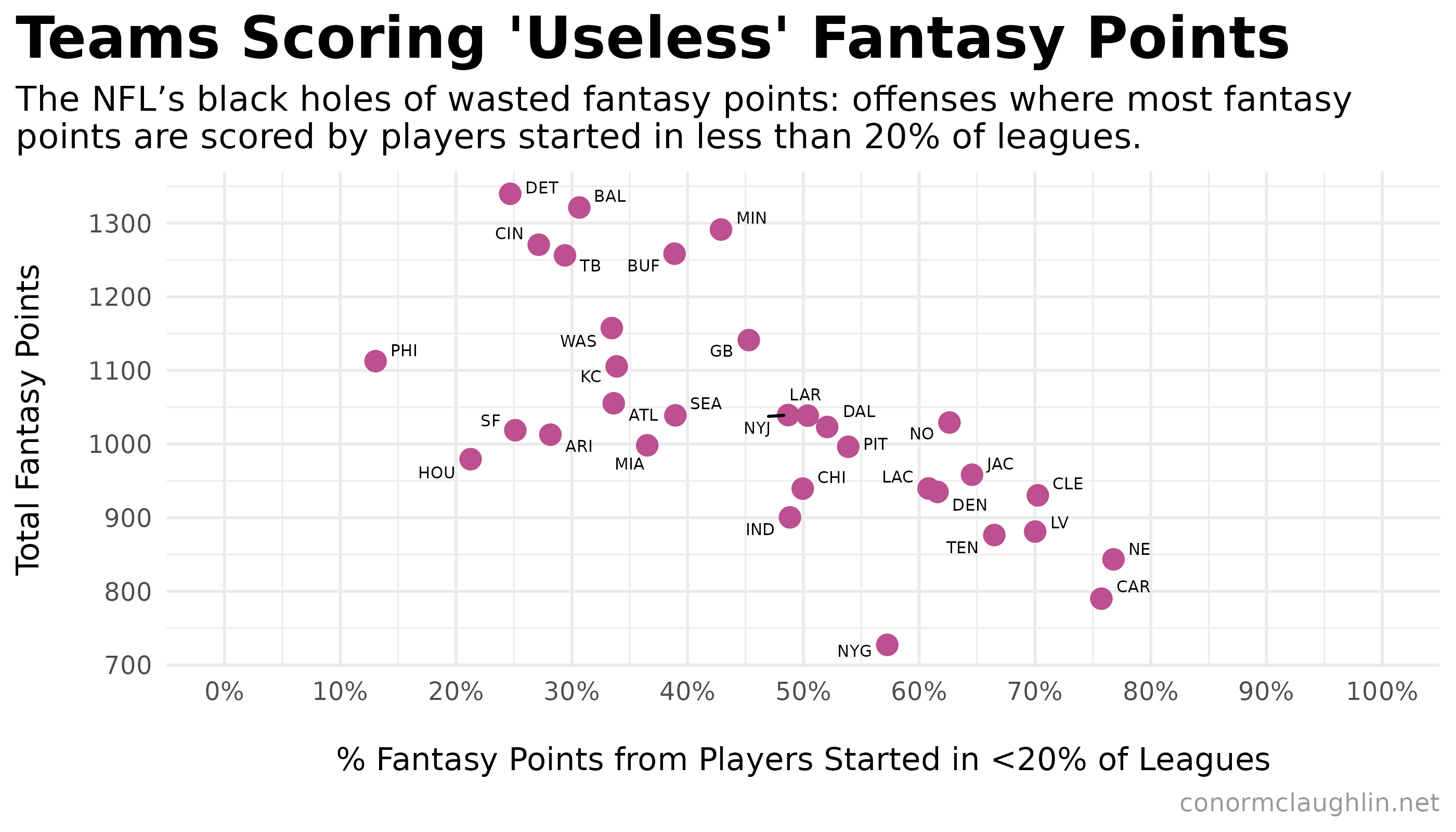
After plotting the teams, we see exactly that cluster emerging! There is a set of teams (including the Broncos and Chargers) where over 60% of the total fantasy points scored for the team come from players started in fewer than 20% of fantasy leagues. It’s fair to say that this chaotic distribution of point scoring is not super conducive to predictable fantasy success - and is the opposite of what we see with the Eagles, which have only 13% of their fantasy points scored by players started in <20% of leagues.
It follows then, that if we flip the x-axis to be the share of points scored by players started in more than eighty percent of leagues, that the Eagles are again a standout.
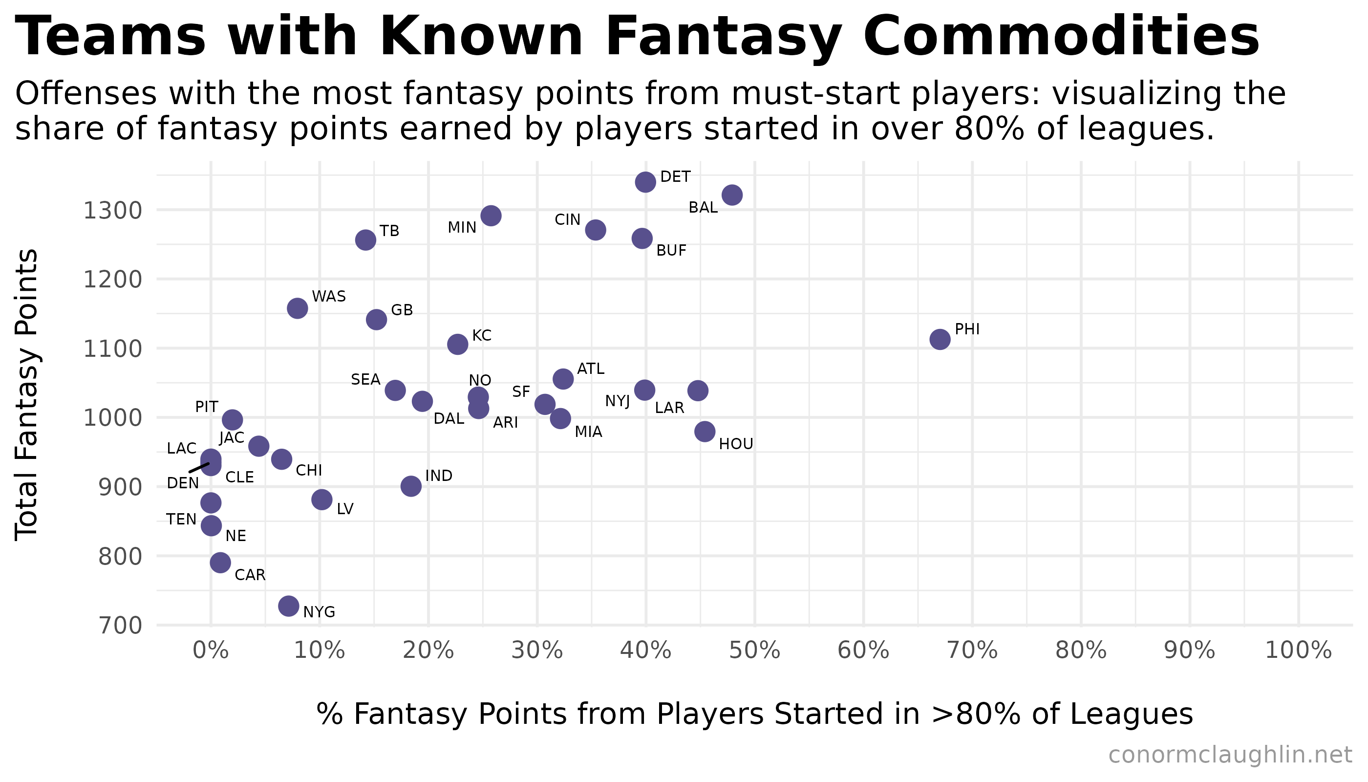
This chart is actually super useful for seeing what teams support the most fantasy-relevant players: with the Ravens, Lions, Bengals, and Bills all up there with the Eagles.
Interestingly, a second-tier of teams emerges in this graphic which have fewer total fantasy points scored but retain a solid concentration of points scored by players started in >80% of leagues… this group, headlined by the Texans, Rams, and Jets, can be thought of as supporting a relatively high number of reliable fantasy contributors for the relative “size” of their offense.