A major storyline this NFL season has been the unprecedented success of kickers on extra-long field goals. In this post, we’ll look at how the kicks being attempted have skewed longer and longer over time - I plan to fast-follow this post with another focusing on how field goal make rate has also evolved through the years!
What’s Going On
It should stand as no surprise to NFL fans that two big trends have emerged in the kicking game:
- Fueled by analytics and more expected-value driven decision-making, teams have become more likely to go for it on fourth and short in the redzone, and less likely to attempt short field goals
- Improvements in the realistic range of kickers (beyond 50 yards) have opened up kick opportunities at distances that would not have been previously feasible
Together, these trends have shifted the distribution of field goal attempts “to the right”, with teams attempting fewer short kicks and more long kicks in the 2020s than they did in the 2010s and the 2000s.
Visualizations
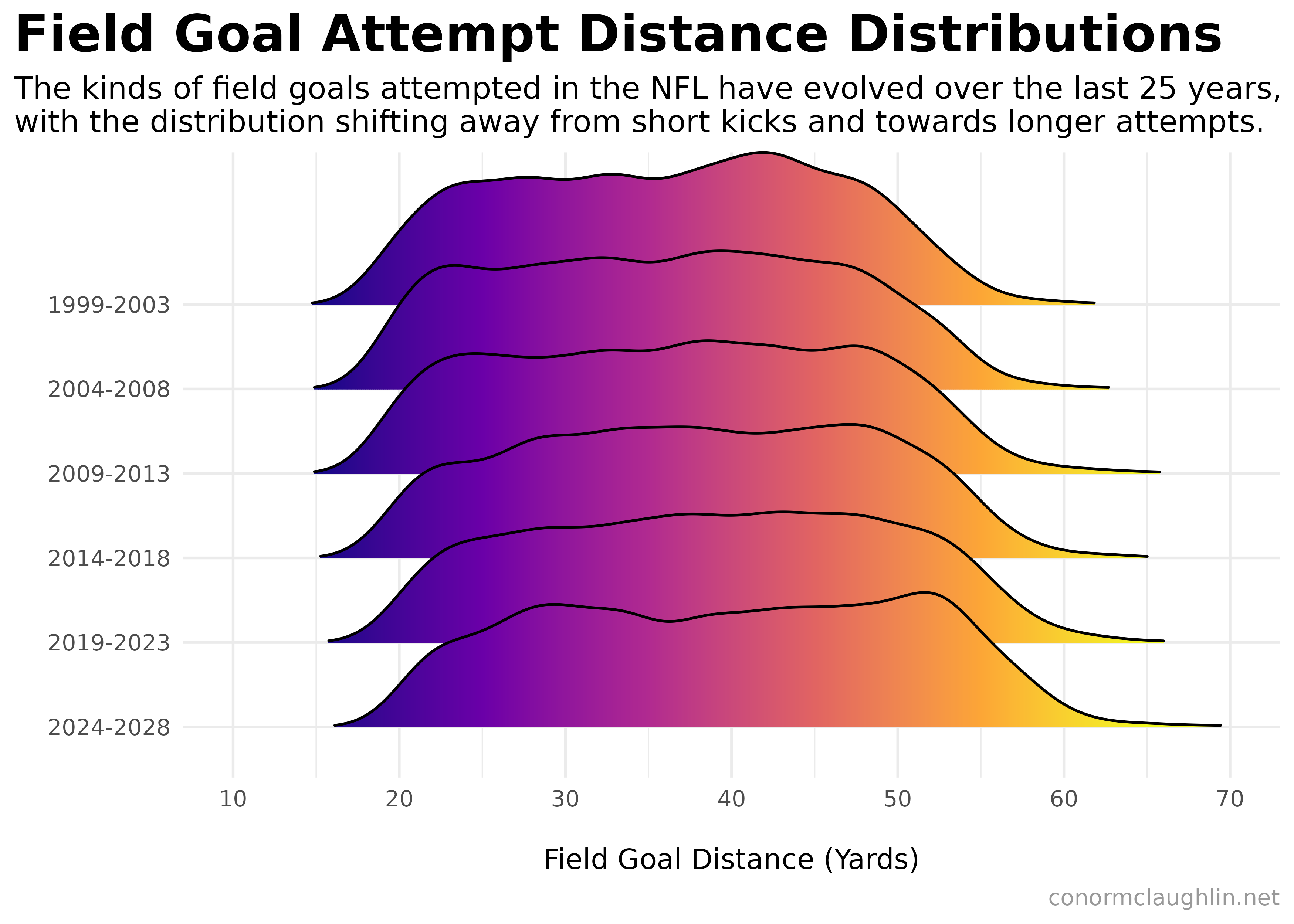
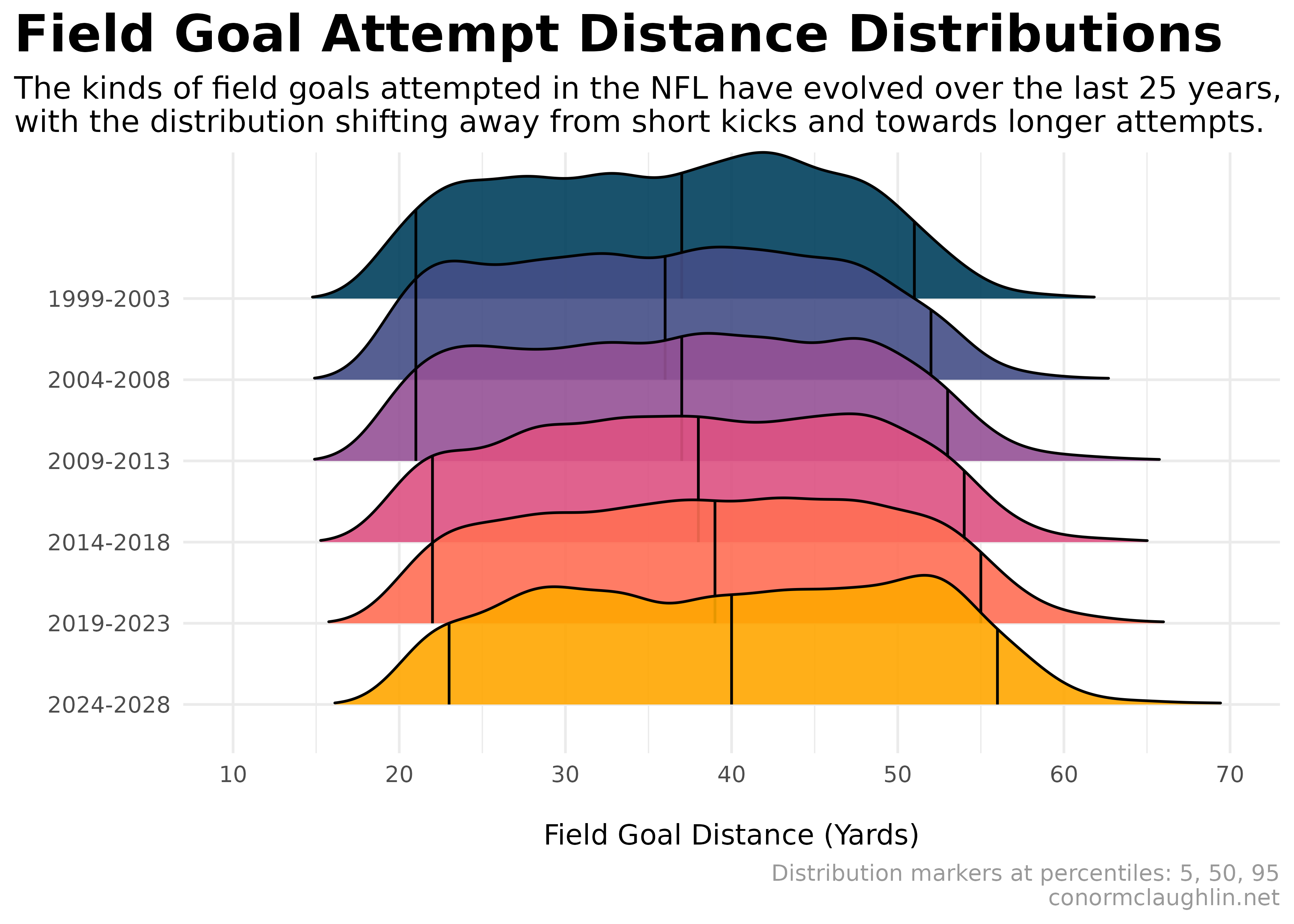
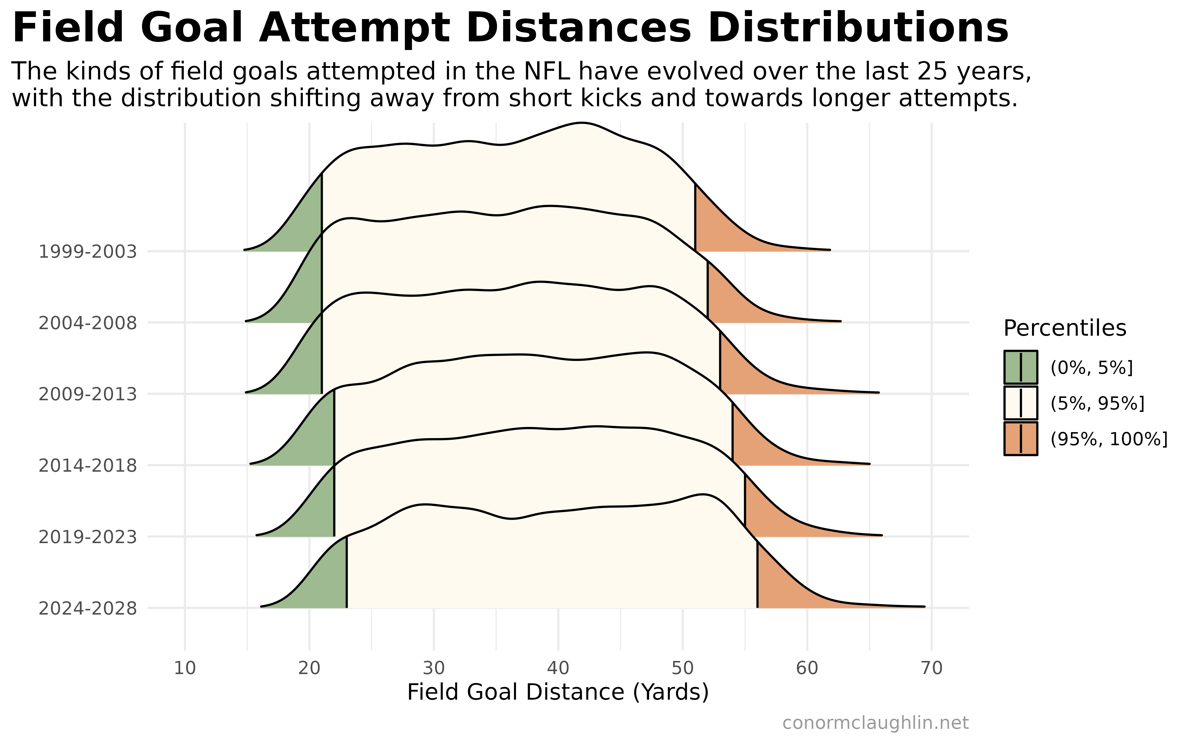
Below are three different ridgeline plots I’ve built to illustrate the changing distribution of field goals attempt distance over the last twenty five years. They all take a slightly different stylistic tack as they look to show the user how the form of the distribution has moved, something that is tough to express with a handful of numbers, but easy for the brain to grasp with shapes to compare.
I think #2 is my personal favorite - would be curious to hear if anyone has strong opinions that #3 or #1 are more effective visuals!
Gradient-Shaded Ridgeline Plot
Ridgeline Plots with Quantile Lines
Ridgeline Plots with Shaded Tails
Code Reference
Acquiring the Data
To get raw, historic data on field goal attempts, the nflreadr package was invaluable. I hope the code below is a useful reference for anyone looking to systematically load and process play-by-play data from the load_pbp function!
Load Play-by-Play Data and Extract Kicks
# Load required libraries
library(tidyverse)
library(lubridate)
library(nflreadr)

# Initialize an empty data frame to store results
all_kicks <- tibble()

# Loop through each year from 1999 to 2024
for (year in 1999:2024) {
  # Load play-by-play data for the specific year
  pbp <- load_pbp(year)

  # Filter and process the data
  kicks <- pbp %>%
    filter(!is.na(field_goal_result)) %>%
    select(game_date, field_goal_result, kick_distance, kicker_player_name) %>%
    mutate(year = year(ymd(game_date)))

  # Append the processed kicks data to the main dataset
  all_kicks <- bind_rows(all_kicks, kicks)

  # Print progress to monitor the loop
  print(paste("Processed year:", year))
}

write_csv(all_kicks, "all_kicks_1999_to_2024.csv")
Processing the Kick Data
library(readr)
library(ggridges)
library(viridisLite)
library(scales)

all_kicks <- read_csv("all_kicks_1999_to_2024.csv")

all_kicks <- all_kicks %>%
  mutate(rounded_year = floor((year - 1999) / 5) * 5 + 1999) %>%
  mutate(year_range = paste0(rounded_year, '-', rounded_year + 4)) %>%
  mutate(fgm = ifelse(field_goal_result == 'made', 1, 0))
Visualizations
Hopefully the code snippets below are helpful for anyone else using the ggridges package to create ridgeline plots using ggplot2 and R!
Gradient-Shaded Ridgeline Plot
ggplot(all_kicks, aes(x = kick_distance, y = reorder(year_range, -rounded_year), group = year_range, fill = stat(x))) +
  geom_density_ridges_gradient(alpha = 0.9, rel_min_height = 0.01) +
  scale_fill_viridis_c(
    option = "C",
    limits = c(15, 65),
    oob = scales::squish,
    guide = "none"
  ) +
  scale_x_continuous(limits = c(10, 70), breaks = seq(10, 70, 10)) +
  coord_cartesian(clip = "off") +
  theme_minimal() +
  theme(
    # panel.grid = element_blank(),
    plot.title = element_text(size = 20, face = "bold"),
    plot.subtitle = element_text(size = 12),
    plot.caption = element_text(colour = "grey60"),
    plot.title.position = "plot"
  ) +
  labs(
    x = "\nField Goal Distance (Yards)",
    y = "",
    title =  "Field Goal Attempt Distance Distributions",
    subtitle = "The kinds of field goals attempted in the NFL have evolved over the last 25 years,\nwith the distribution shifting away from short kicks and towards longer attempts.",
    caption = "conormclaughlin.net"
  )
Ridgeline Plot with Quantile Lines
ggplot(all_kicks, aes(x = kick_distance, y = reorder(year_range, -rounded_year), group = year_range, fill = year_range)) +
  stat_density_ridges(
    quantile_lines = TRUE,
    alpha = 0.9,
    quantiles = c(0.05, 0.5, 0.95),
    rel_min_height = 0.01
  ) +
  scale_fill_manual(
    values = c("#003f5c", "#444e86", "#955196", "#dd5182", "#ff6e54", "#ffa600"),
    guide = "none"
  ) +
  scale_x_continuous(limits = c(10, 70), breaks = seq(10, 70, 10)) +
  coord_cartesian(clip = "off") +
  theme_minimal() +
  theme(
    # panel.grid = element_blank(),
    plot.title = element_text(size = 20, face = "bold"),
    plot.subtitle = element_text(size = 12),
    plot.caption = element_text(colour = "grey60"),
    plot.title.position = "plot"
  ) +
  labs(
    x = "\nField Goal Distance (Yards)",
    y = "",
    title =  "Field Goal Attempt Distance Distributions",
    subtitle = "The kinds of field goals attempted in the NFL have evolved over the last 25 years,\nwith the distribution shifting away from short kicks and towards longer attempts.",
    caption = "Distribution markers at percentiles: 5, 50, 95\nconormclaughlin.net"
  )
Ridgeline Plot with Highlighted Tails
ggplot(all_kicks, aes(x = kick_distance, y = reorder(year_range, -rounded_year), group = year_range, fill = stat(quantile))) +
  stat_density_ridges(
    quantile_lines = TRUE,
    calc_ecdf = TRUE,
    geom = "density_ridges_gradient",
    quantiles = c(0.05, 0.95),
    rel_min_height = 0.01
  ) +
  scale_fill_manual(
    name = "Percentiles",
    values = c("#9eba90", "floralwhite", "#e5a276"),
    labels = c("(0%, 5%]", "(5%, 95%]", "(95%, 100%]")
  ) +
  scale_x_continuous(limits = c(10, 70), breaks = seq(10, 70, 10)) +
  coord_cartesian(clip = "off") +
  theme_minimal() +
  theme(
    # panel.grid = element_blank(),
    plot.title = element_text(size = 20, face = "bold"),
    plot.subtitle = element_text(size = 12),
    plot.caption = element_text(colour = "grey60"),
    plot.title.position = "plot"
  ) +
  labs(
    x = "\nField Goal Distance (Yards)",
    y = "",
    title =  "Field Goal Attempt Distances Distributions",
    subtitle = "The kinds of field goals attempted in the NFL have evolved over the last 25 years,\nwith the distribution shifting away from short kicks and towards longer attempts.",
    caption = "conormclaughlin.net"
  )