Earlier this week I read a great article from Car and Driver, which ran some controlled tests to try to understand how electric vehicle acceleration varies as a function of battery charge level. In their research, they found that the Hyundai Ioniq 5 has a remarkably flat performance curve, while the Lucid Air and especially the Rivian R1T see more performance degradation as their battery charge levels drop.
While I have no quibbles with their methodology or takeaways - I was disappointed to see that the graphics they published to visualize their findings were overblown and kind of unrealistic looking, in a very Microsoft WordArt kind of way.
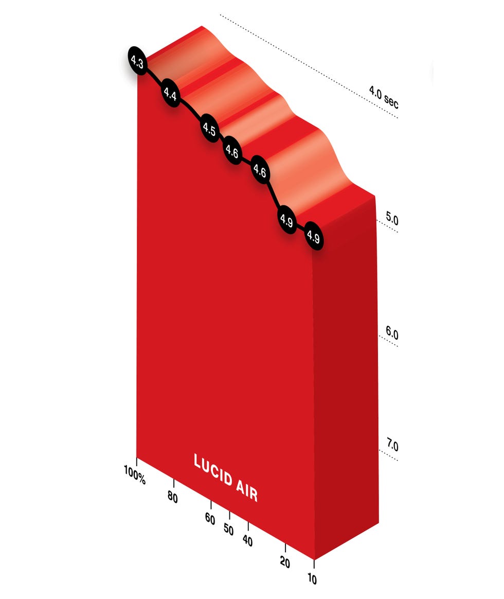
Take a look at this guy for example - some nits to pick:
- It’s angled sideways, for no clear benefit
- The y-axis is reverse-ordered, against conventional expectations. This was seemingly done to show performance “dropping off” at lower battery levels, but is less intuitive than simply showing times increasing, in my opinion
- Having tall area charts like this prevents more than one data series from being shown at a time - meaning Car and Driver didn’t publish any views that compared all three EVs in one chart
An Improved Visualization

Long time readers might remember a post I wrote in 2023 which “cleaned up” a crazy radial bar chart published by S&P Global Mobility into a much cleaner new graphic… consider this post the second in that series of “fixing bad charts”!
To show the Car and Driver team a better, although significantly less flashy, view of this data, I spent fifteen minutes cooking in ggplot and landed on the graphic below:

Key improvements I made, with an eye on simplifying the visuals and allowing the data to speak for itself:
- All three car models are shown the same plot, so that divergences in trend amongst them really stand out
- 0-60 mph acceleration time is shown on an un-reversed y-axis - aligning with conventional norms on data ordering
- Removing the heavy, angled, area chart style and moving to a simple line chart with points reduces unnecessary visual weight
Code Reference
Car and Driver - I’m linking you my code as a reference, but don’t be afraid to holler if you want a consultant on the next “data art” piece you publish!
df %>% filter(charge_level >= 5) %>%
ggplot(aes(x = charge_level, y = time, color = model)) +
  geom_line() +
  geom_point() +
  scale_y_continuous(breaks = scales::pretty_breaks(8)) +
  scale_x_reverse(breaks = scales::pretty_breaks(n = 8)) +
  scale_color_discrete(name = "EV Model") +
  theme_minimal() +
  theme(
      legend.background = element_rect(color = NA),
      plot.title = element_text(size = 20, face = "bold"),
      plot.subtitle = element_text(size = 12),
      plot.caption = element_text(colour = "grey60"),
      plot.title.position = "plot",
      panel.grid.minor.y = element_blank()
    ) +
  labs(
    x = "\nBattery Charge (%)",
    y = "0 - 60 mph Time (sec)\n",
    title = "How Battery State of Charge Affects EV Acceleration",
    subtitle = "In contrast to the Lucid and Rivian, which see linear performance declines, the Hyundai does not show\nany degradation in acceleration as the battery level drops from 100% to 20%. All models see some \nperformance declines at that point, with the Rivian's sharp performance throttling standing out\nas it goes from being the fastest car in the mix to the slowest, when low on charge.\n",
    caption = "Data from Car and Driver\nconormclaughlin.net"
  )