In the spring of 2024, I started a new job in West Hollywood and quickly noticed something amusing on my commute home: it was almost always warmer at my office than at my house in Santa Monica. On many evenings, the temperature would drop five or even ten degrees between WeHo and the coast.
Nerd that I am, I decided this microclimate was worth mapping myself. That decision sent me down a year-long rabbit hole involving DIY temperature sensors, two separate deployment attempts, and about $100 spent - none of which produced the data I needed!
Eventually, I did what I probably should have done from the start and turned to the Open-Meteo weather API to gather hourly temperatures per neighborhood.
With that context in mind, lets laugh at my failed data-gathering attempts before getting to the charts that actually tell the story and help us capture a small slice of the unique Los Angeles microclimate.
Failed Data Gathering Attempts
“Temps in Trees”
My first attempt was characterized by a scrappy attitude but complete lack of awareness around data quality. Turns out there is a little something called “shade” which produces vastly different temperature figures than “sun”… I did not do nearly enough to normalize for this!
Also, while I thought taping the sensors up in trees along San Vicente would be more or less innocuous, all of my friends reported that the baggies looked extremely suspicious and seemed like some sort of “drug thing” - which in retrospect… is fair.

The Data
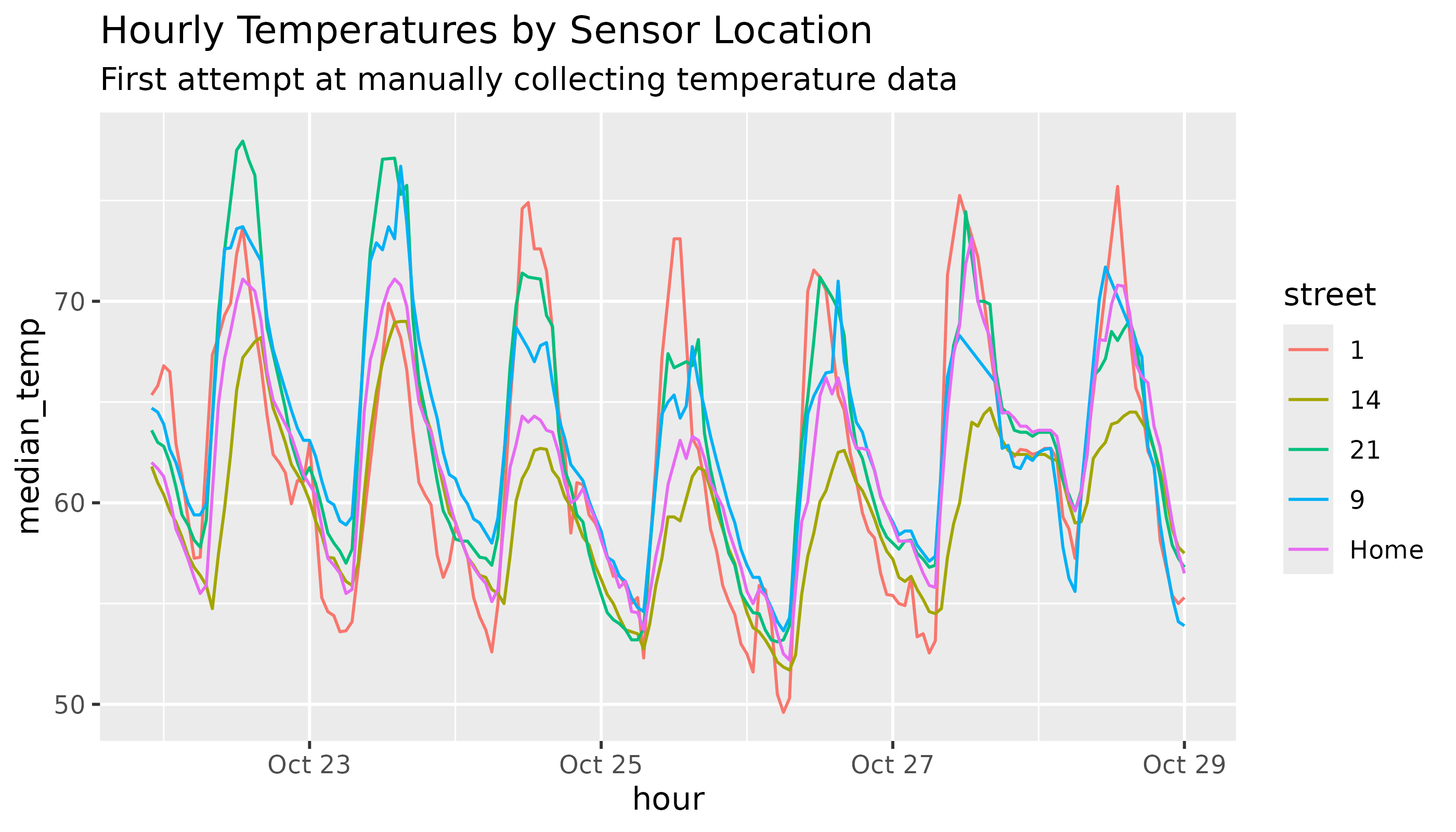
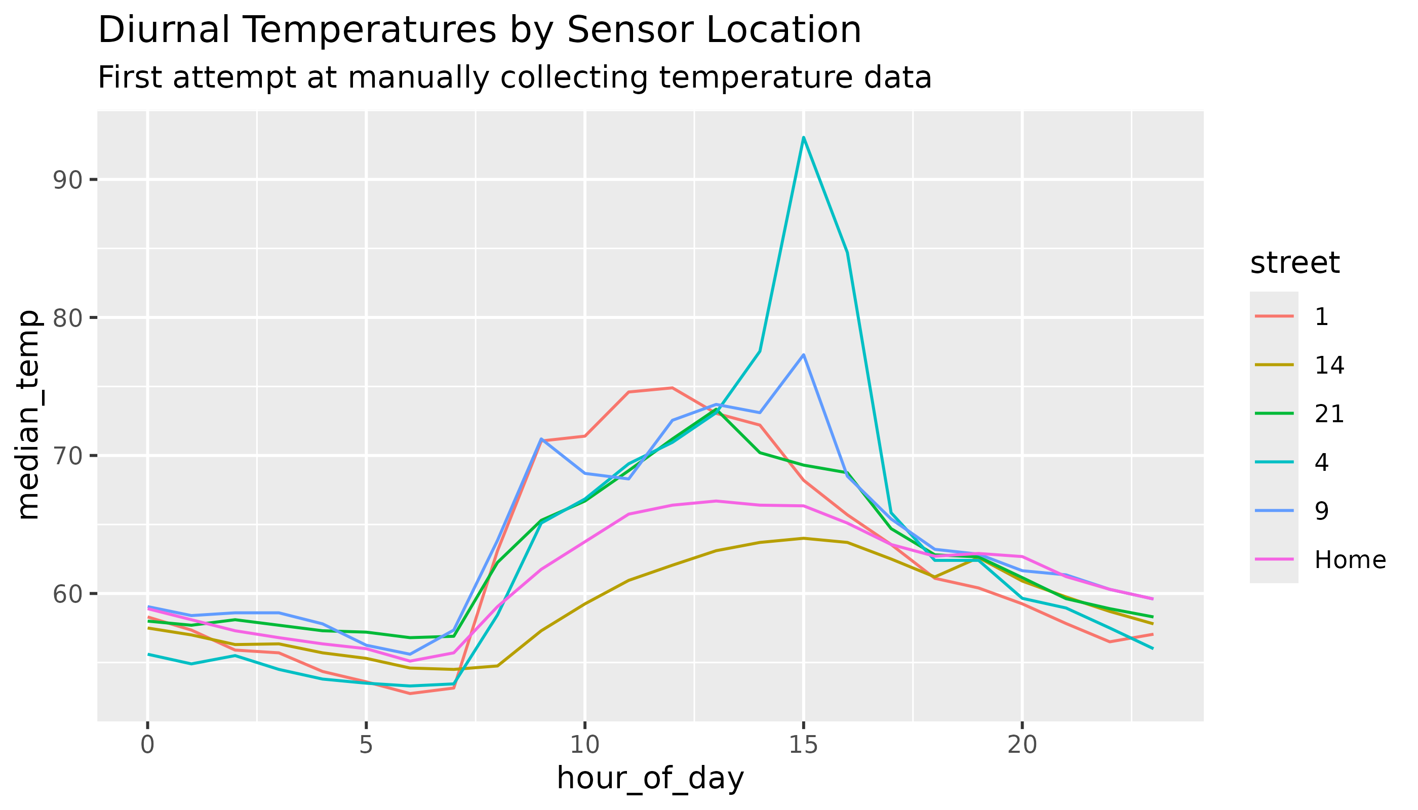
I was very sad to see that the data from the five sensors I was able to recover (clearly three of them were too sketchy for local dog-walkers to let stand) was generally nonsensical - it did not return the clear story (of temps subtly rising as we go inland) that I hoped for.
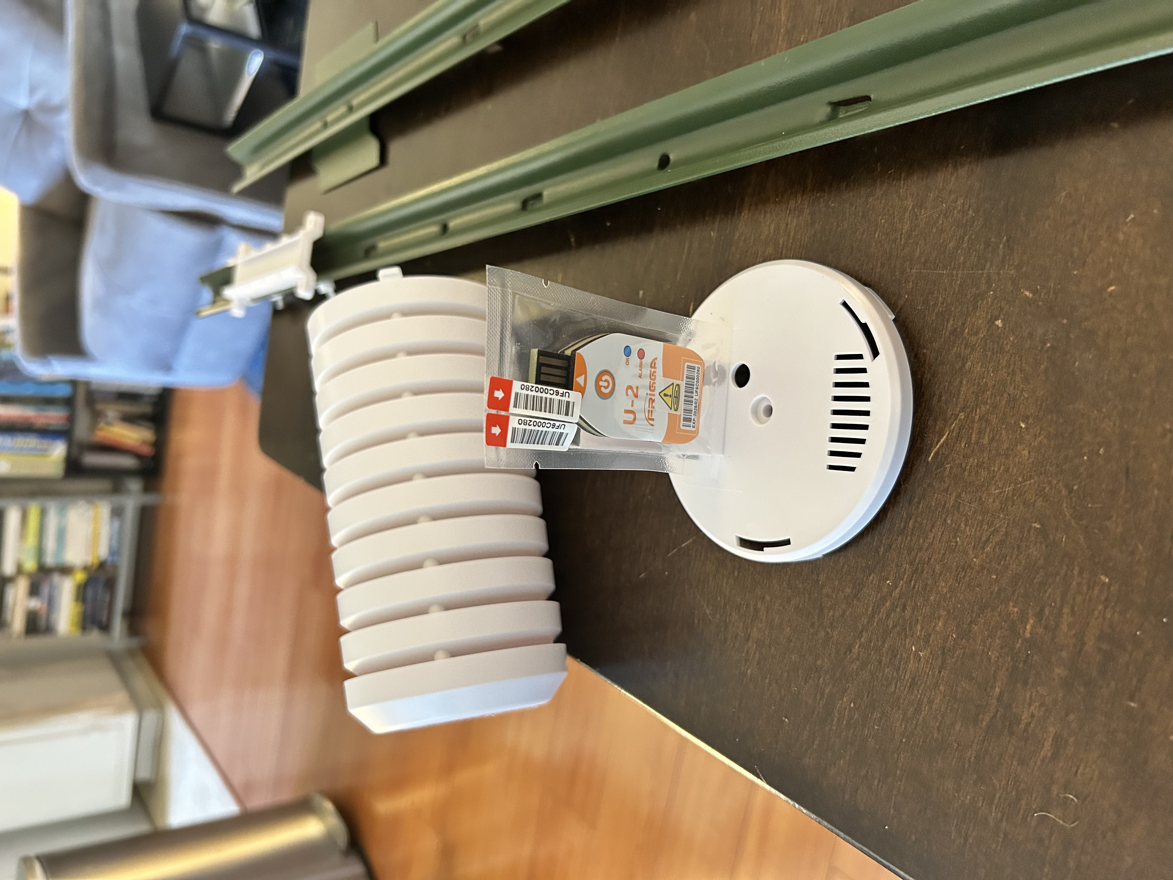
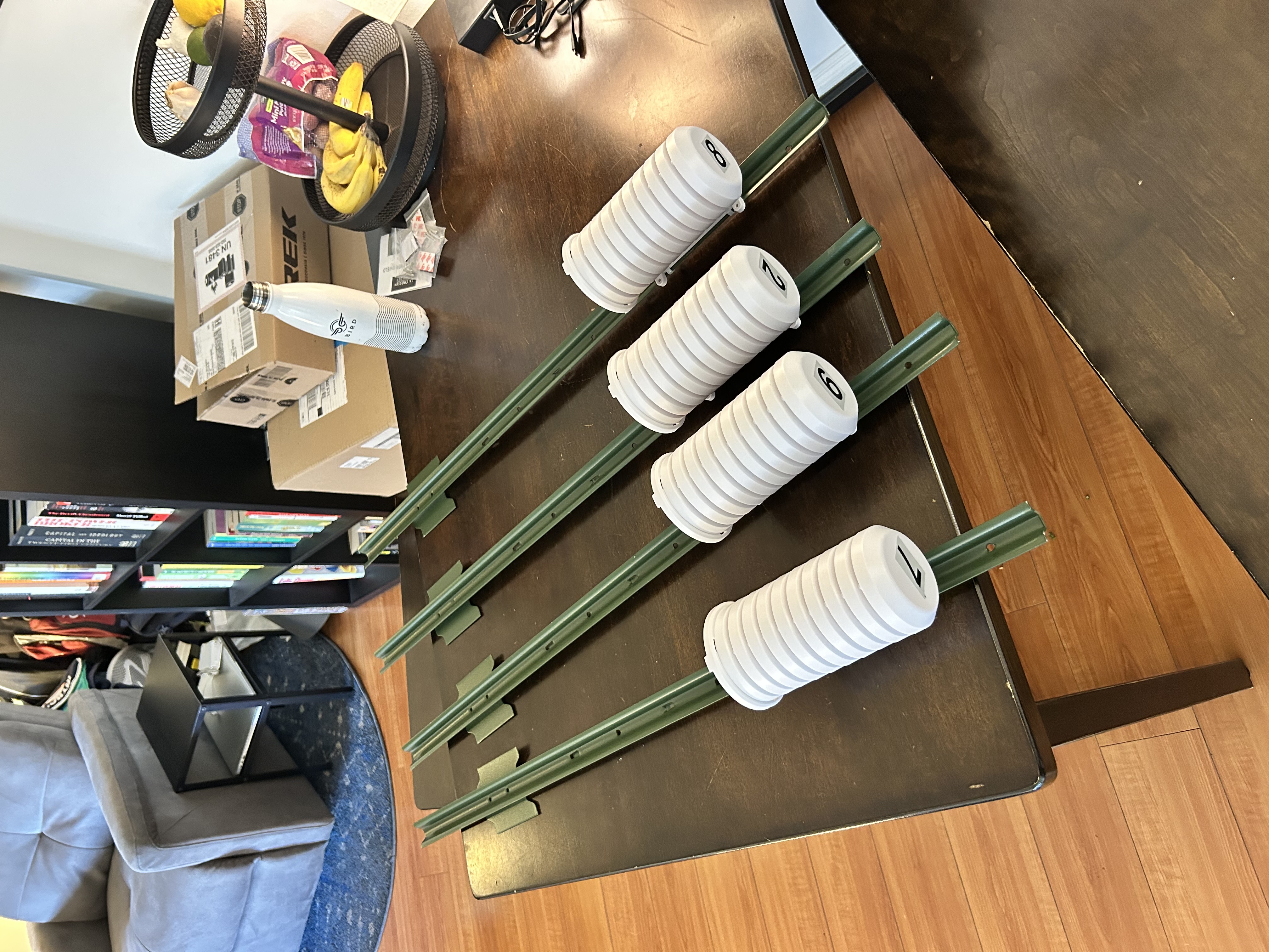
“Gonna do this Right” / Pretending I’m the Utility Company
It took a few months to rebuild my strength after my initial failure, but eventually, I decided I was ready to dive in again.
This time I made some investments:
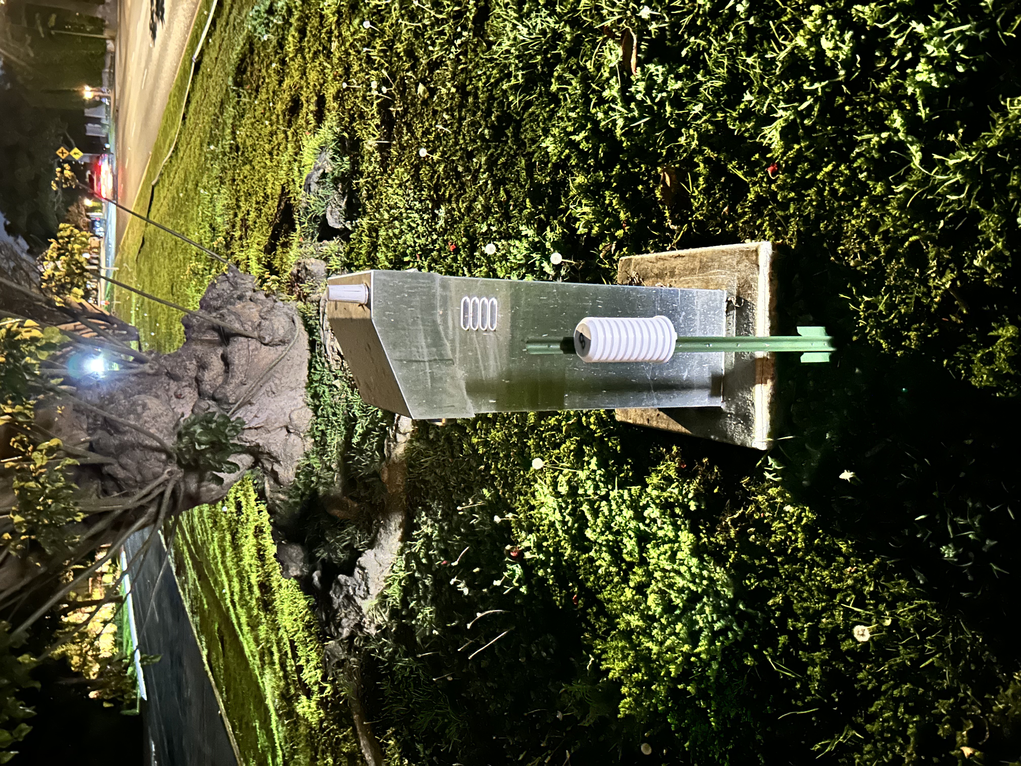
- shields: to mask the sensors from direct sunlight and collect more accurate observations
- stakes: to make the units look professional and give plausible deniability that they belong to a utility or something
- spread: I placed sensors further inland than in attempt #1, with sensors at Bundy in Brentwood and on Sunset in Beverly Hills, in an attempt to capture more geographic diversity
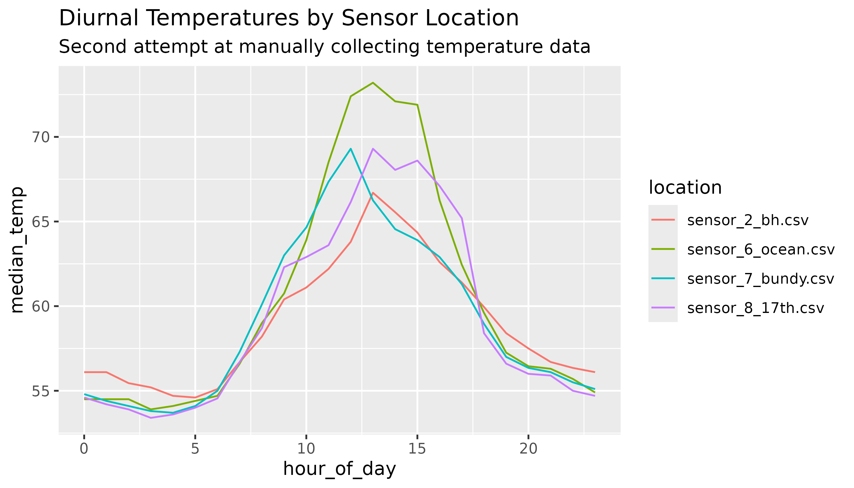
The Data
Despite my labors, the data from this attempt was also a bust - I didn’t observe nearly the variation I expected across sensors, and the variation I did see didn’t make much sense (Ocean Ave in SM being the hottest, Beverly Hills having the least temperature variance).
Using a Weather API
With my home-grown data collection clearly not accurate enough for the job, I made the call to get on with things and simply obtain the data I needed from a weather service and move on to the visualizing!
Open-Meteo was perfect for my needs - they operate a free API that allows for historic weather queries for any given coordinates at a 1km resolution: not fine enough granularity to measure intra-Santa Monica variance, but plenty to compare neighborhoods against each other.
Gathering Data from Open-Meteo
Function to Fetch Open-Meteo Hourly Temps
library(httr)
library(jsonlite)
library(dplyr)
library(lubridate)

# Helper function to fetch hourly data for one location
fetch_openmeteo_hourly <- function(lat, lon, start_date, end_date, location_name) {
  base_url <- "https://archive-api.open-meteo.com/v1/archive"

  res <- GET(
    url = base_url,
    query = list(
      latitude  = lat,
      longitude = lon,
      start_date = format(start_date, "%Y-%m-%d"),
      end_date   = format(end_date, "%Y-%m-%d"),
      hourly = paste(c("temperature_2m", "relative_humidity_2m"), collapse = ","),
      timezone = "America/Los_Angeles",
      temperature_unit = "fahrenheit"
    )
  )

  stop_for_status(res)
  dat <- content(res, as = "text", encoding = "UTF-8") |> fromJSON()

  # Defensive check
  if (is.null(dat$hourly) || is.null(dat$hourly$time)) {
    stop("No hourly data returned for ", location_name)
  }

  out <- tibble(
    datetime            = ymd_hm(dat$hourly$time, tz = "America/Los_Angeles"),
    temperature_2m      = dat$hourly$temperature_2m,
    relative_humidity_2m = dat$hourly$relative_humidity_2m,
    location            = location_name,
    temperature_unit = "fahrenheit"
  )

  out
}
Fetch Weather for Last 18 Months for Each Location
# Define date range: past 18 months
end_date   <- Sys.Date()
start_date <- end_date %m-% months(18)

# Coordinates for each location
coords <- tribble(
  ~location,        ~lat,      ~lon,
  "Santa Monica",   34.02,    -118.5,
  "West Hollywood", 34.0900,  -118.3617,
  "DTLA",           34.0407,  -118.2468
)

# Fetch data for all locations
hourly_list <- lapply(seq_len(nrow(coords)), function(i) {
  fetch_openmeteo_hourly(
    lat  = coords$lat[i],
    lon  = coords$lon[i],
    start_date = start_date,
    end_date   = end_date,
    location_name = coords$location[i]
  )
})

hourly_all <- bind_rows(hourly_list)
Visualizing the Los Angeles Microclimate
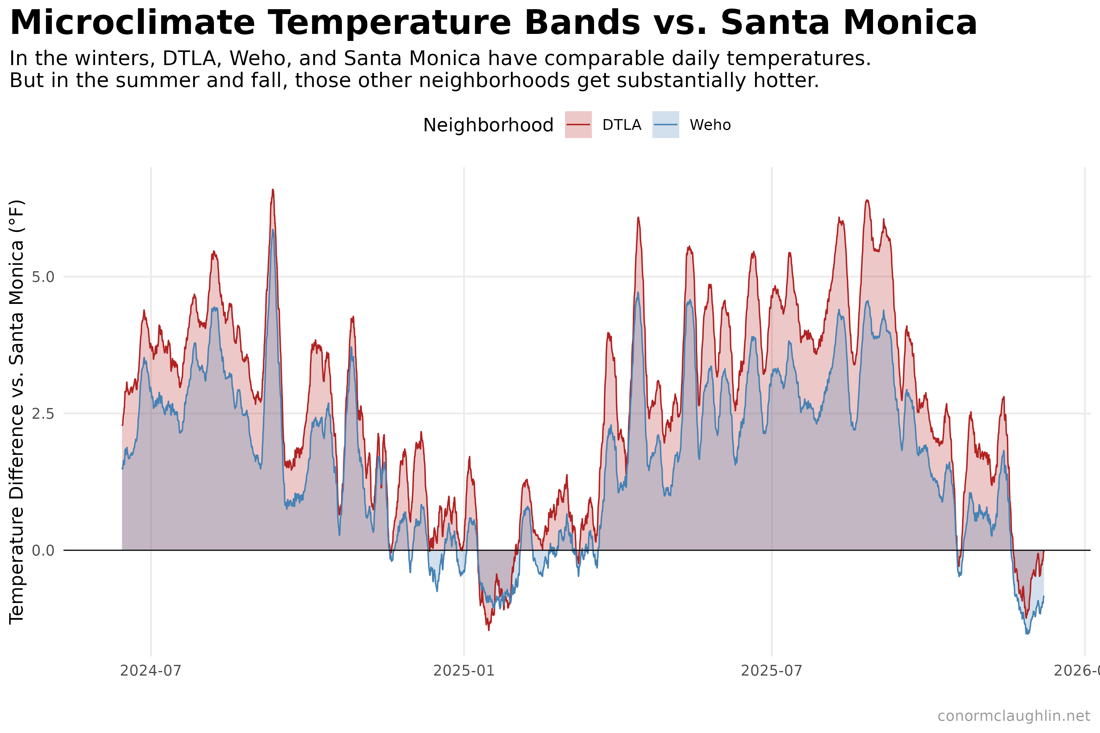
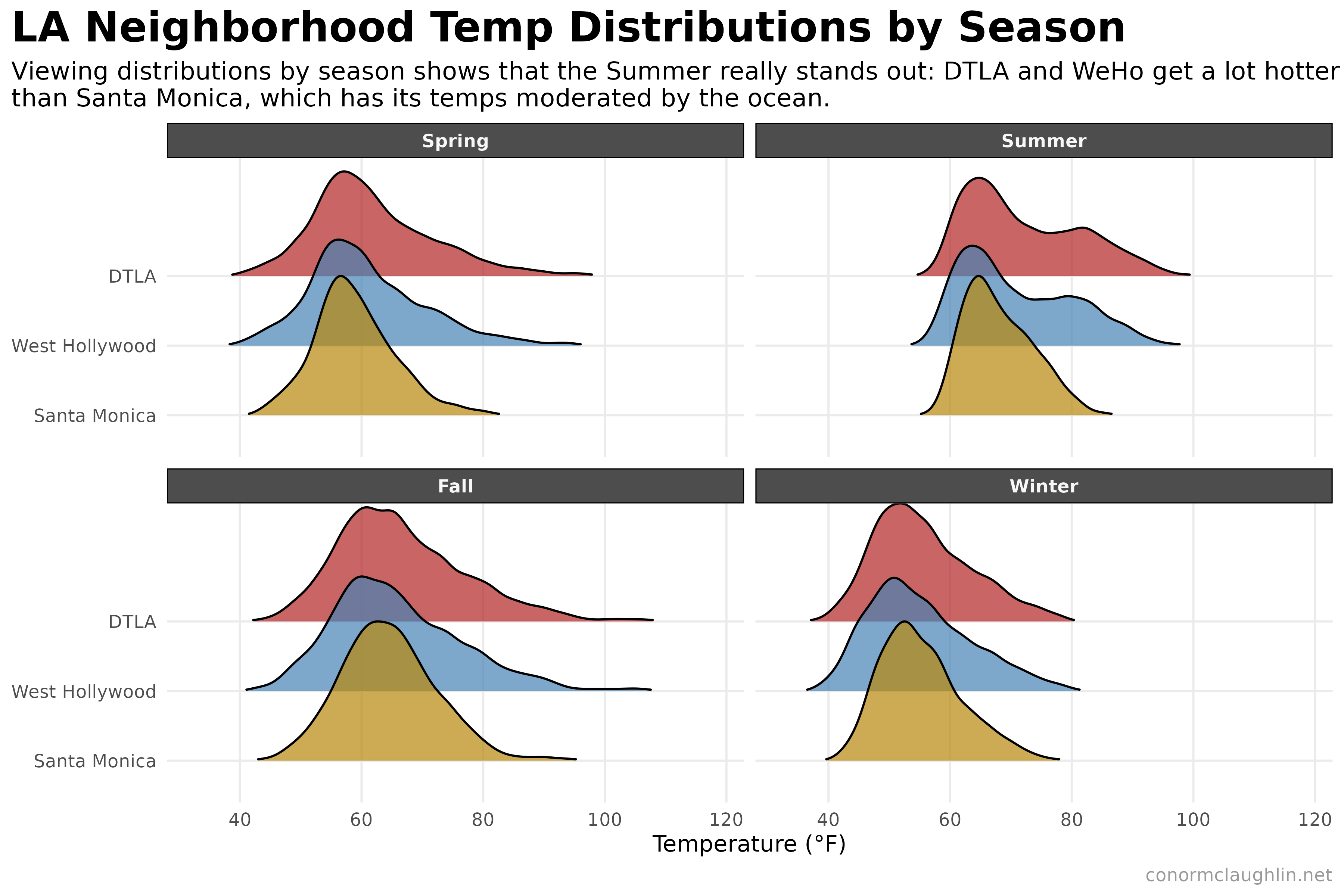
While there aren’t any big surprises in the data, it is super fun to see that the temperature gradient between neighborhoods does exist, generally matches my anecdotal observations from my commute, and seems to be pretty robust! The two main themes shown in the data are:
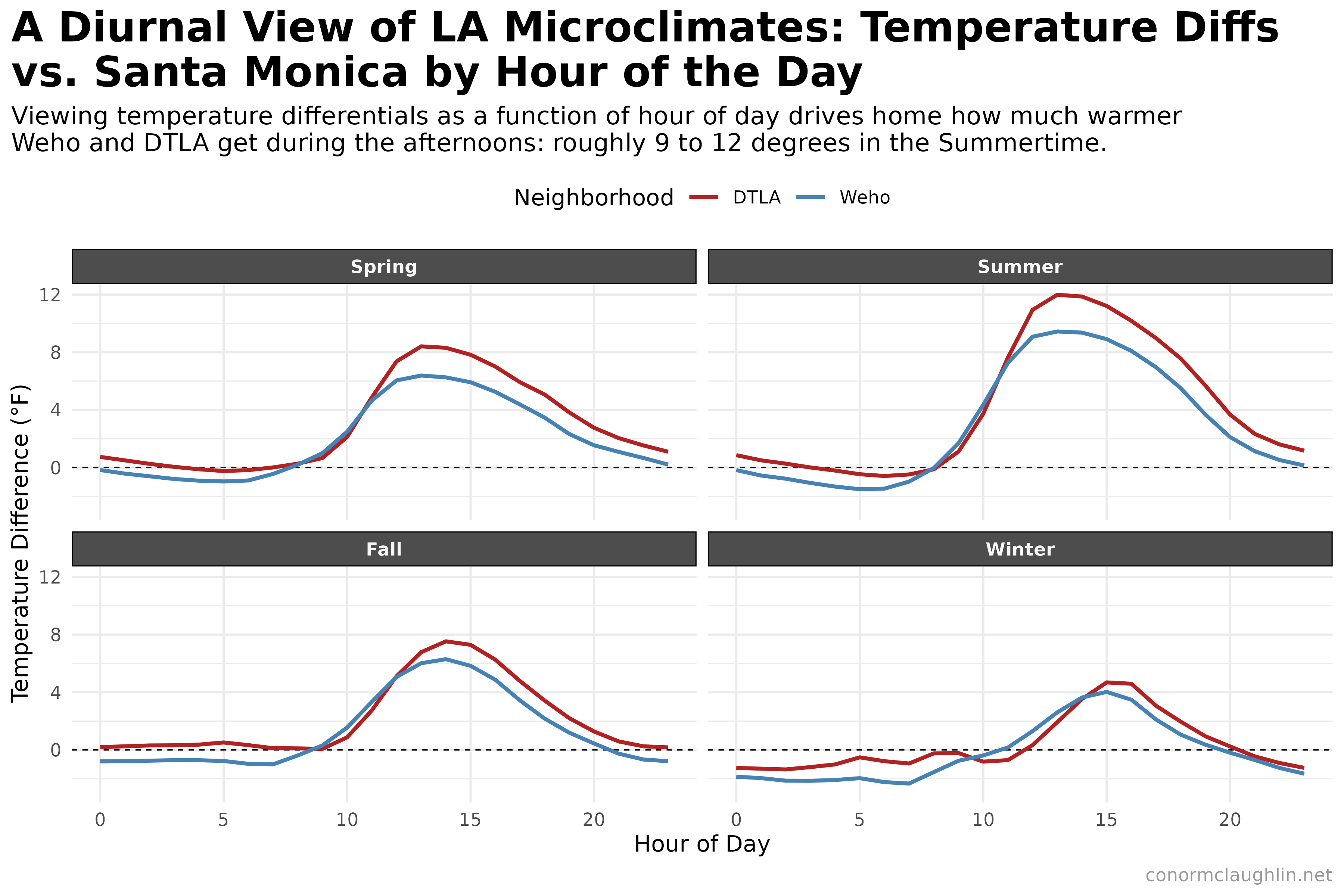
- Hour of Day effects: viewing the diurnal temperature ranges, we see that WeHo and DTLA get quite a bit warmer than Santa Monica in the afternoons - in the Summertime, the difference can be almost 10 degrees. This difference generally goes away overnight though - we see very little difference between 10pm and 10am, which is a cool finding
- Month of Year effects: unlike the Summer, in the Winter there is essentially no difference in temperatures between the three neighborhoods - DTLA and WeHo are actually a hair warmer than SM. We see the shoulder seasons sitting somewhere in between, with the temperature distributions showing a comparable center but much larger tails as the neighborhoods get further from the ocean