One of the most interesting backstories at the 2026 World Cup has been the huge surge in “foreign-born” players who compete for a different nation than their birth country. Per the BBC, foreign-born players now account for 23.2% of all players, up meaningfully from 16.5% in the 2022 World Cup in Qatar, and 11.4% in the 2018 World Cup in Russia.
Nowhere was this trend more visible than in the France vs Morocco quarterfinal, in which roughly half of the starting Moroccan side was actually born in France, making the match almost an all-French affair!
Visualizations of This Trend Have Been Lacking
While there has been a lot of great reporting on this foreign-born player trend, I can’t say the same for the data visualization side of the house. The best graphics I’ve seen to date are a chord chart and map - both of which I found useful but overloaded with information and hard to easily parse.
Chord Chart
While I think this sort of chart has the potential to be really cool, this one doesn’t land for me. There are simply too many countries included, which causes a multiplicative explosion in the number of links between nations, and results in too many data points and lines. Though it might be “cool-looking”, it fails at its goal of educating the audience about key flows between countries.
Posts from the dataisbeautiful
community on Reddit
Birthplace Map
Likewise, this map is incredibly rich with detail, but doesn’t intuitively tell me the story of what’s most important - players from X, playing for Y! As is, there are just tons of pins - interesting to poke around, but hard to develop a story from.
Visualizing the Flow of Foreign-Born Players
I knew I needed to take matters into my own hands, and after fiddling with the data for a little while, I think I’ve landed on a much more intuitive view of this data!
Below is a simple flow diagram, which quantifies the Born In <> Plays For relationships between countries. This sort of graphic is commonly referred to as a Sankey diagram, which I was able to use the ggalluvial framework to visualize.
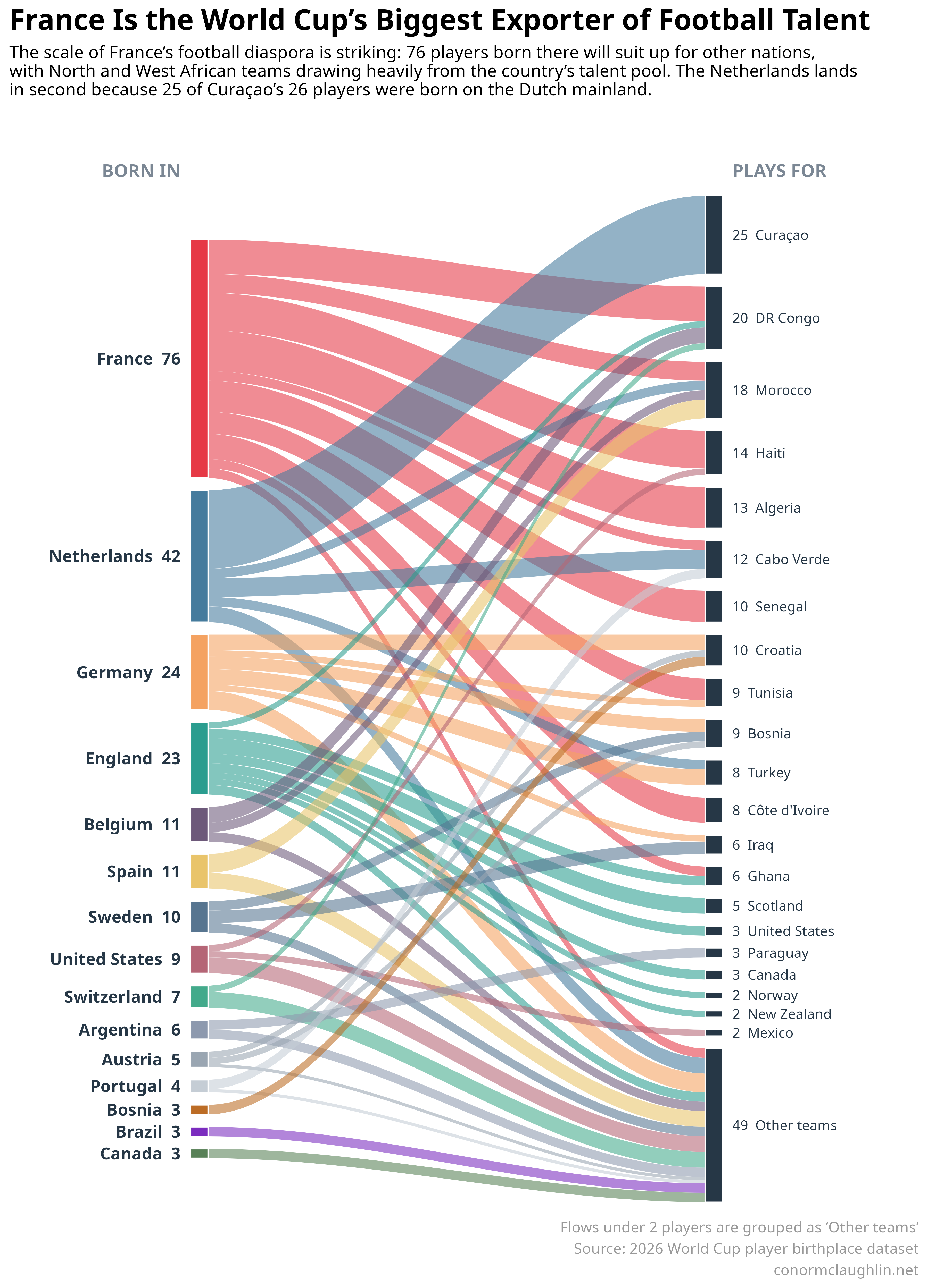
A few observations from the data:
- Holy smokes, French players really are everywhere in this World Cup
- They make up meaningful shares of the rosters of DR Congo, Morocco, Haiti, Algeria, Senegal, Tunisia, and Ivory Coast
- Reading deeper, it seems like the banlieues surrounding Paris are the single richest source of footballing talent in the world - and with only 26 spots available on the French national team, it makes sense that some very talented players from the region might declare for a foreign side instead
- In contrast to the Curaçao-centric nature of the Netherlands, Germany and England are connected to a broader set of countries. While England’s connections seem more colonial in nature, Germany’s seem more connected to modern-day migration trends
- Clearly, Western Europe has a strong advantage over the rest of the world in producing world-class football players. While colonialism helps explain some of the flows that we see between countries, I think it’s clear that the macro trend is being driven by crazy agglomeration effects in places like France and England, which have deeply rooted networks for identifying and nurturing talent, creating a feedback loop à la Silicon Valley
Code Reference
I used the player-level data that powers the birthplace map as the source for my analysis - thanks to /u/_mAn_ for compiling that data!
library(tidyverse)
library(ggalluvial)

players <- read_csv("birthplaces_of_every_2026_fifa_world_cup_player.csv") %>%
  mutate(
    foreign_born = `Foreign-born` == "Yes",
    birth_country = str_trim(str_extract(`Birth town`, "[^,]+$")),
    plays_for = `National Team`
  )

flows <- players %>%
  filter(foreign_born) %>%
  count(birth_country, plays_for, name = "players")
I limited the chart to the 15 largest birthplace groups, then combined one-player destinations into an “Other teams” bucket.
top_birth_countries <- flows %>%
  group_by(birth_country) %>%
  summarise(players = sum(players), .groups = "drop") %>%
  slice_max(players, n = 15) %>%
  pull(birth_country)

plot_flows <- flows %>%
  filter(birth_country %in% top_birth_countries) %>%
  mutate(destination = if_else(players < 2, "Other teams", plays_for)) %>%
  summarise(players = sum(players), .by = c(birth_country, destination))
Then I created the final deliverable using the ggalluvial library - here’s the core structure of that visual.
ggplot(
  plot_flows,
  aes(axis1 = birth_country, axis2 = destination, y = players)
) +
  geom_alluvium(
    aes(fill = birth_country),
    width = 0.06,
    alpha = 0.62,
    color = NA
  ) +
  geom_stratum(width = 0.06, color = "white") +
  geom_text(
    stat = "stratum",
    aes(label = after_stat(stratum)),
    size = 3
  ) +
  scale_x_discrete(
    limits = c("Born In", "Plays For"),
    expand = c(0.08, 0.08)
  ) +
  guides(fill = "none") +
  theme_minimal() +
  theme(
    axis.title = element_blank(),
    axis.text.y = element_blank(),
    panel.grid = element_blank(),
    plot.title = element_text(size = 20, face = "bold"),
    plot.subtitle = element_text(size = 12),
    plot.caption = element_text(colour = "grey60")
  )