As a long-term lover of the Home Run Derby (by far a better event than the All Star Game), I had SUCH A BLAST watching this year’s version, which scrapped the batting clock and introduced a swing cap.
While the change towards timed rounds in 2015 was fun for a few years, over time it became unwatchable as players responded to the incentives in play by swinging as fast (and as much) as possible - taking away all of the drama and majesty of the home runs themselves.
In this year’s Derby, I thought it was more enjoyable to watch the anticipation build as the players used their finite allotment of swings, and the experience as a viewer felt so much more cinematic and less frenetic, with a lot more time to appreciate the longest and hardest hit balls.
With that in mind, to honor the new format and the competitors themselves, I thought it would be fun to do a little blog post, visualizing the Derby data in a few ways!
Fetching the Data
Before we get into the visuals, I wanted to share how I scraped the source data from MLB StatsAPI… they have an unlisted but dedicated Home Run Derby endpoint which provides per-swing records - making it easy to retrieve the data we need for visualization purposes.
library(tidyverse)
library(jsonlite)

game_pk <- 838655
derby_url <- paste0(
  "https://statsapi.mlb.com/api/v1/homeRunDerby/",
  game_pk,
  "/mixed"
)

derby_raw <- fromJSON(derby_url, simplifyVector = FALSE)

swings <- derby_raw$rounds |>
  purrr::imap_dfr(\(round_obj, round_index) {
    round_obj$participants |>
      purrr::map_dfr(\(participant) {
        participant$swings |>
          purrr::imap_dfr(\(swing, swing_index) {
            tibble(
              round = as.integer(round_index),
              player = participant$player$fullName,
              swing_in_round = swing_index,
              is_home_run = isTRUE(swing$isHomeRun),
              distance = purrr::pluck(swing, "hitData", "totalDistance", .default = NA_real_)
            )
          })
      })
  }) |>
  group_by(round, player) |>
  mutate(
    home_runs_so_far = cumsum(is_home_run),
    outs_so_far = cumsum(!is_home_run)
  ) |>
  ungroup()
Round by Round Results
First Round
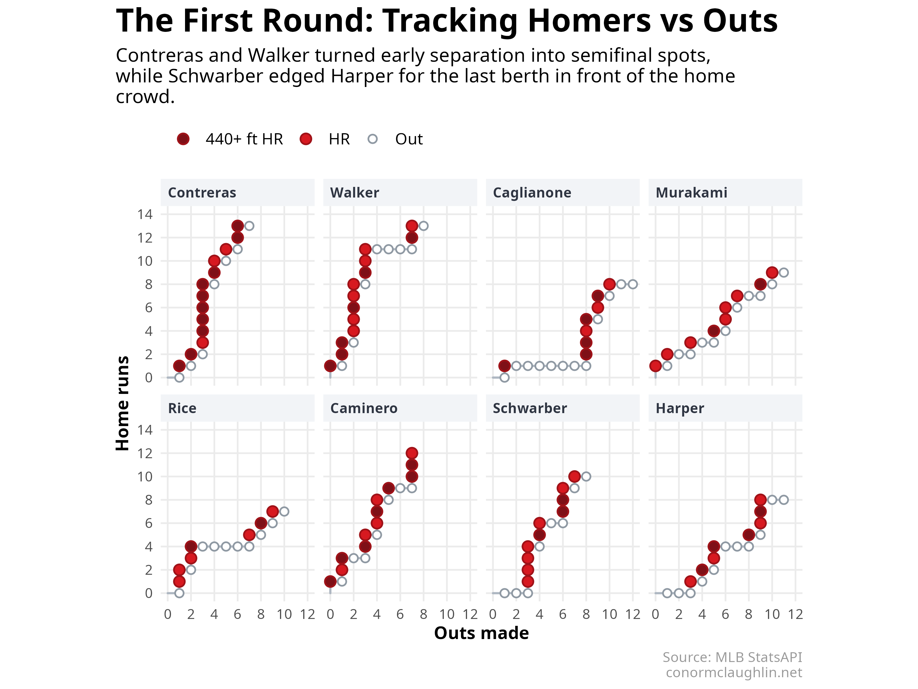
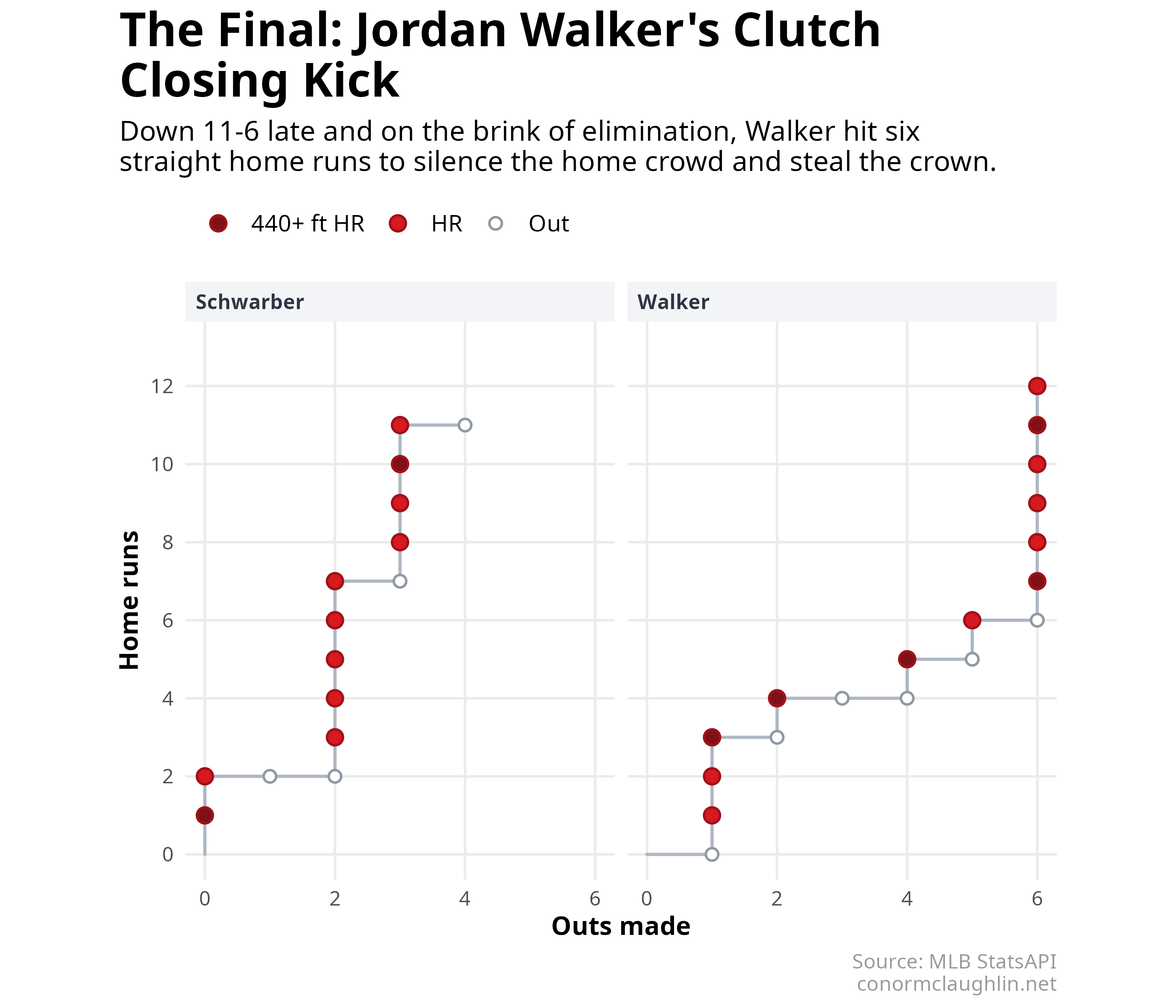
After playing with (and rejecting) a bunch of different line chart views, I discovered that I really liked visualizing the twenty swings as home runs versus outs. Hopefully your brain will agree - I found that the steepness of the line (and presence of flat stretches) made it immediately apparent how each hitter was doing, and visually it’s really easy to compare the relative performance of different players.
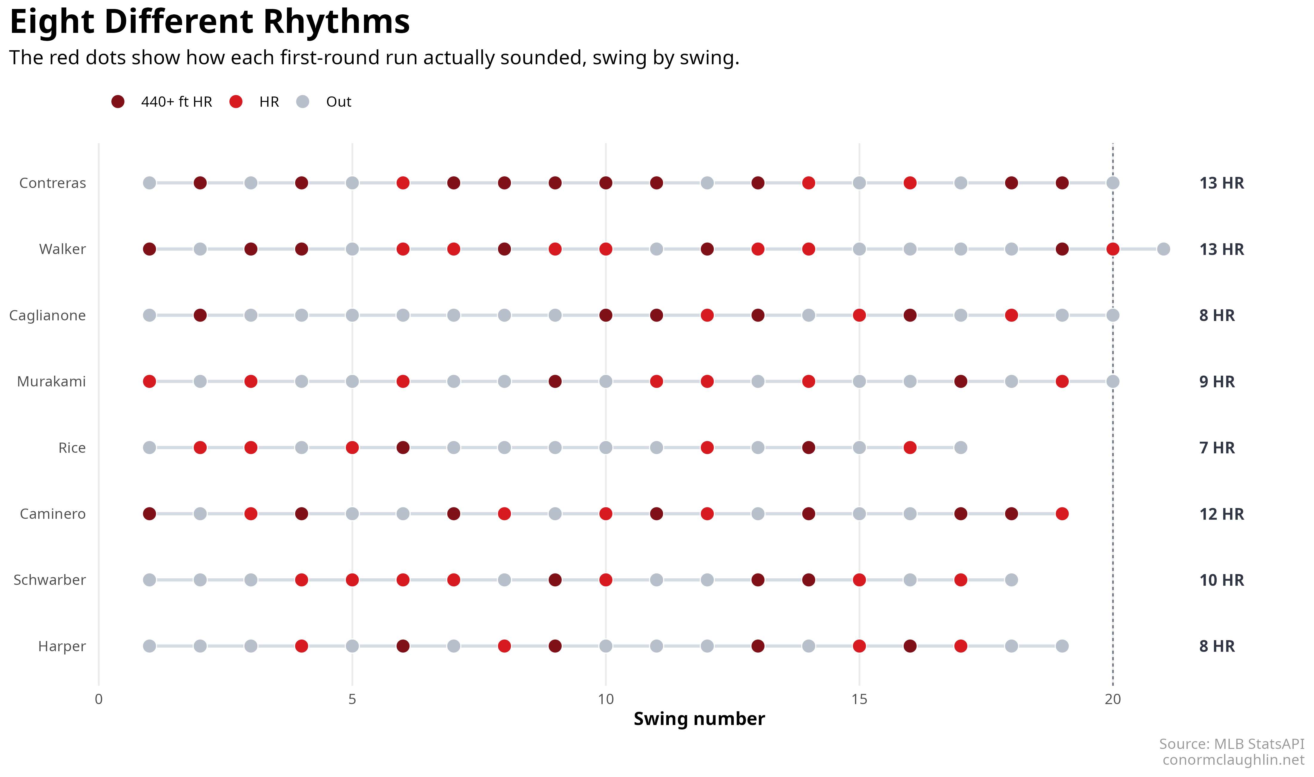
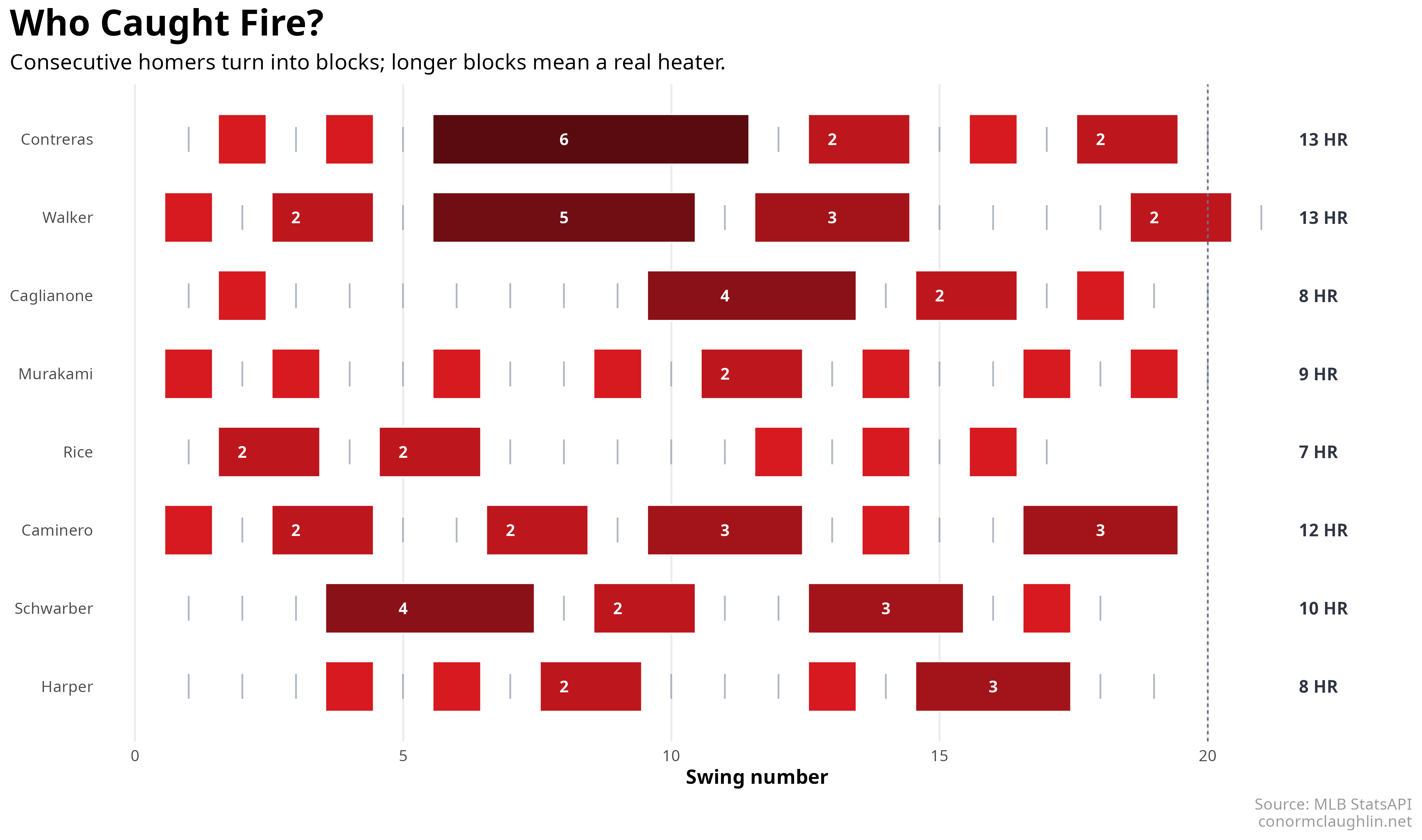
Two other chart formats that I thought were fun:
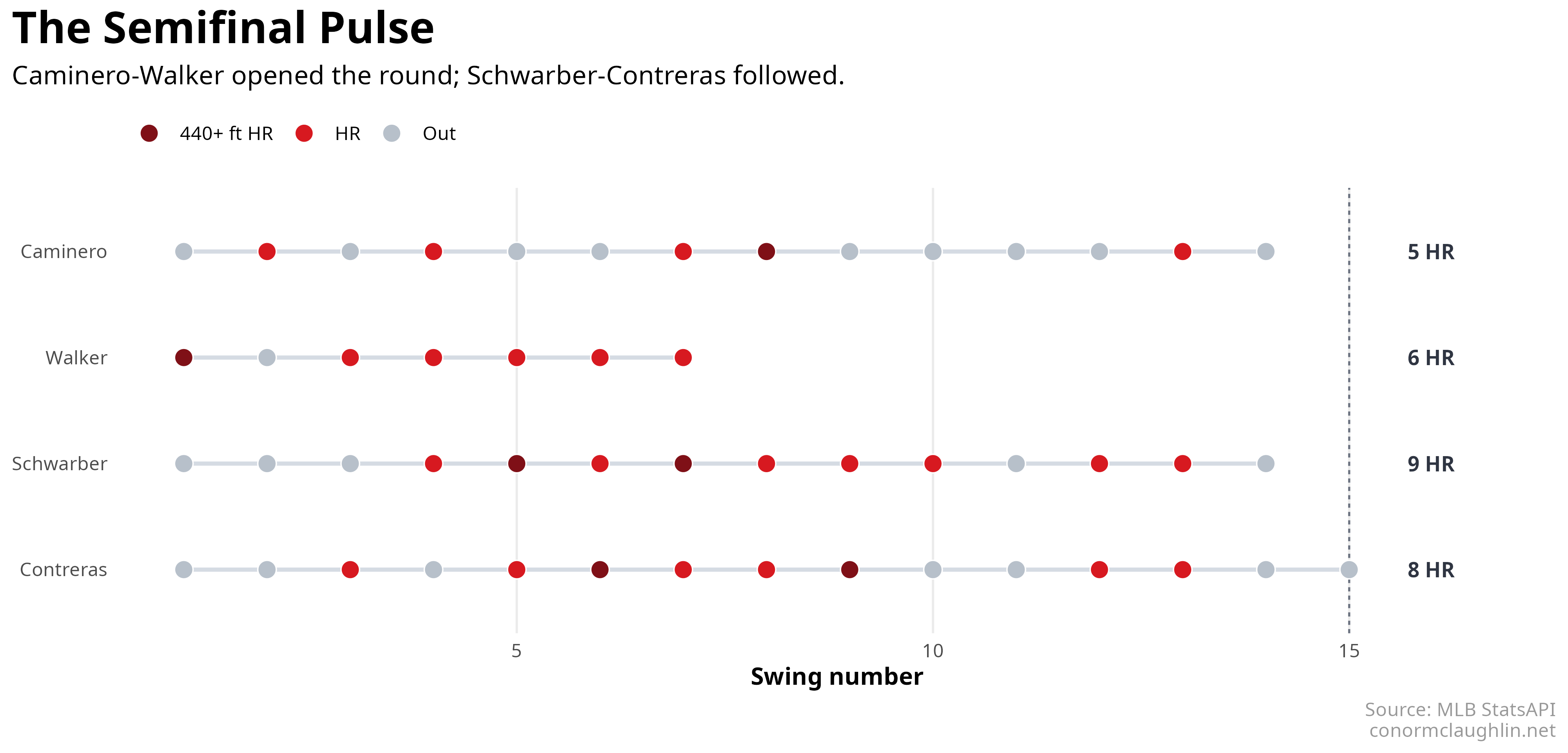
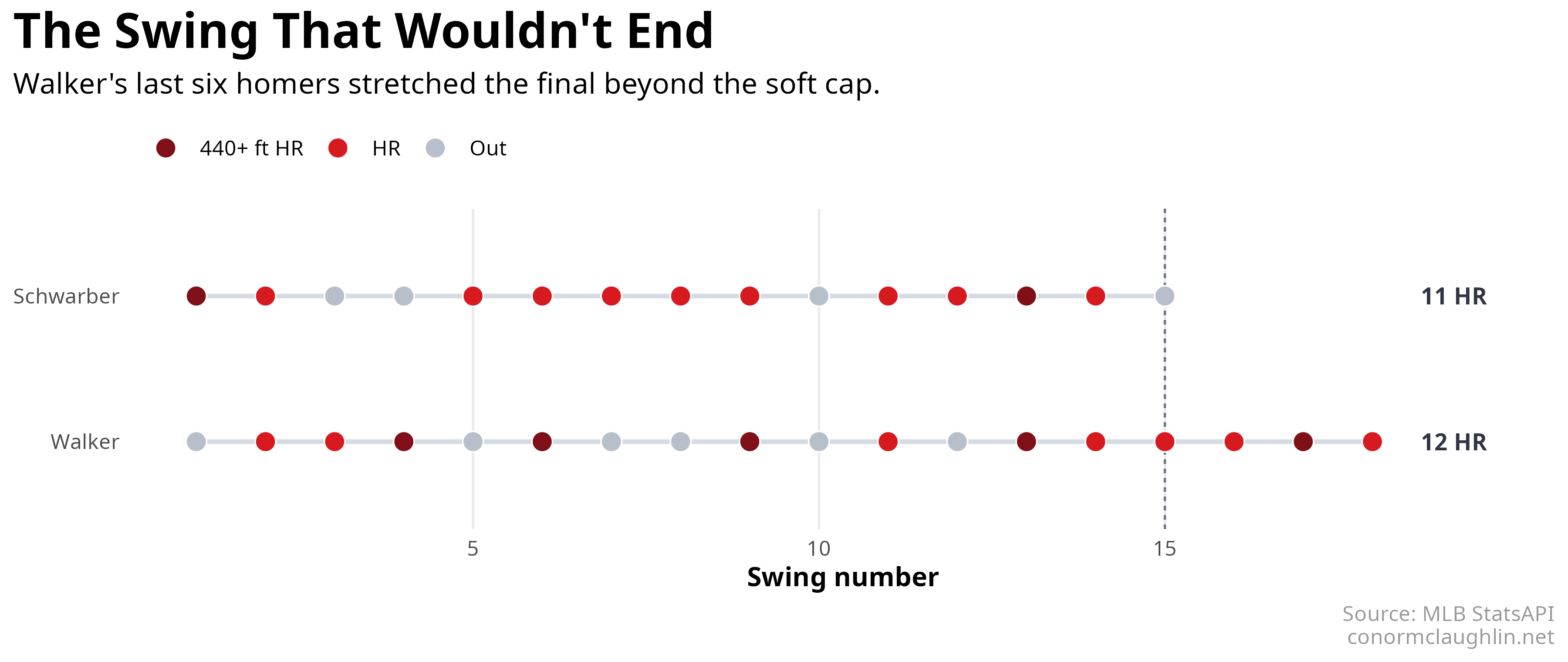
- rhythm chart: plots a linear timeline of swings with each home run called out almost like a musical “beat”
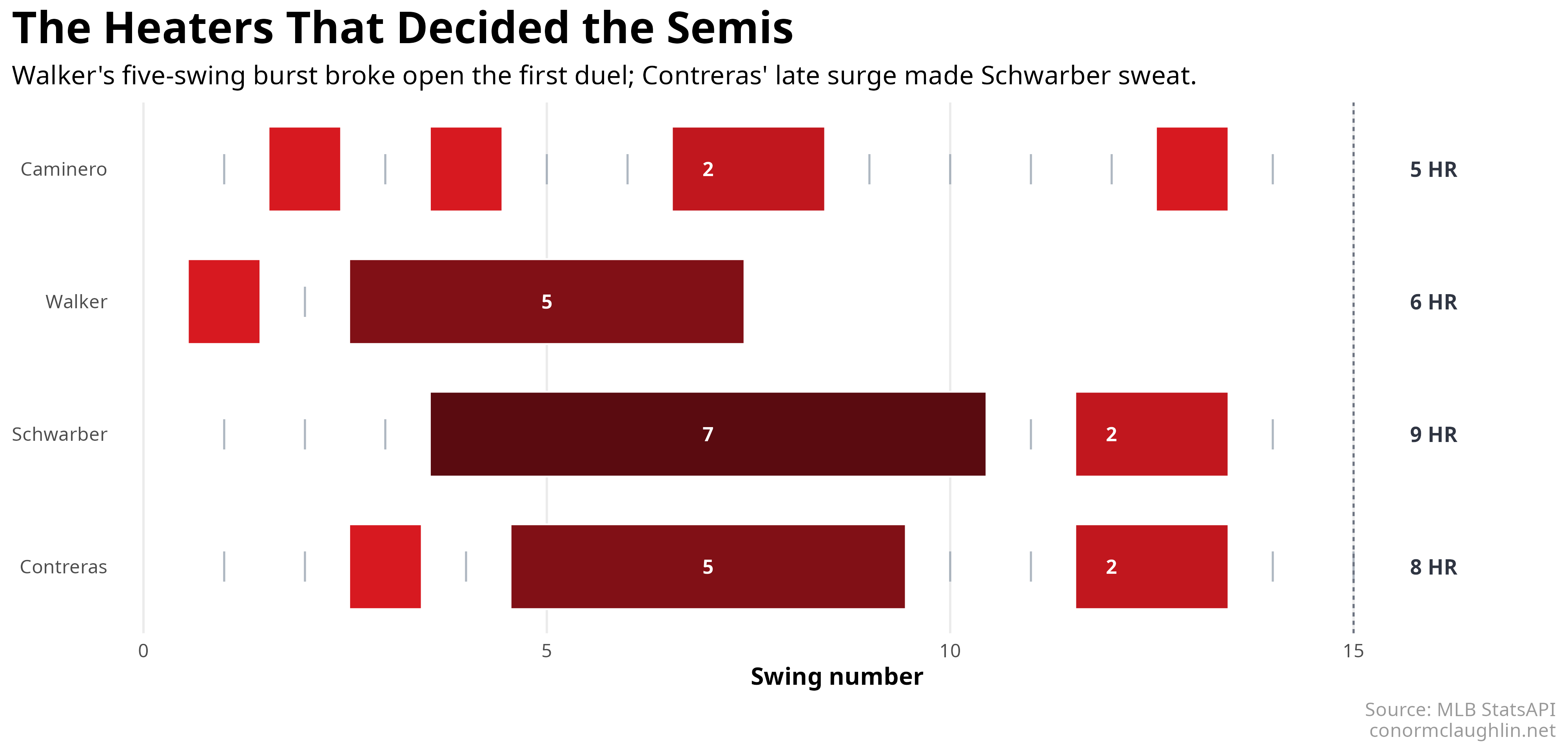
- streak chart: helps illustrate how players can get hot and sustain runs
Semi-Final Round
Final Round
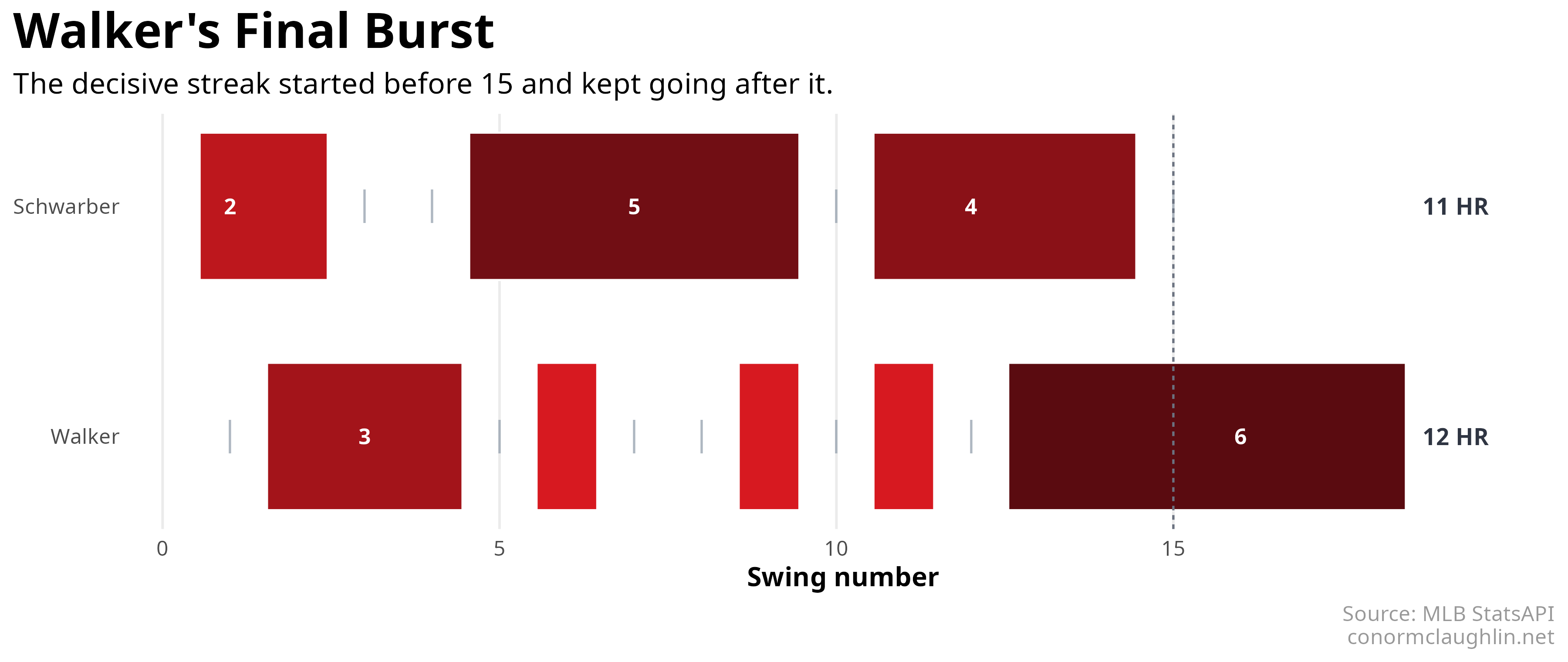
When Schwarber opened the final round in front of his home crowd with 11 home runs in 15 swings, it sure felt like the Derby was fated to be his. That feeling was only heightened by Jordan Walker’s relatively slow start, which left him trailing 6 vs 11 with only 3 swings remaining.
However, this Derby’s new format had a critical “last swing” condition - players can keep hitting on their “final swing” as long as they keep homering. In an incredibly impressive performance of physical and mental focus, Walker locked in and hit 6 straight home runs on his “final swing”, knocking Schwarber off the podium and stunning the crowd at Citizens Bank Park.
Zooming in on Distance
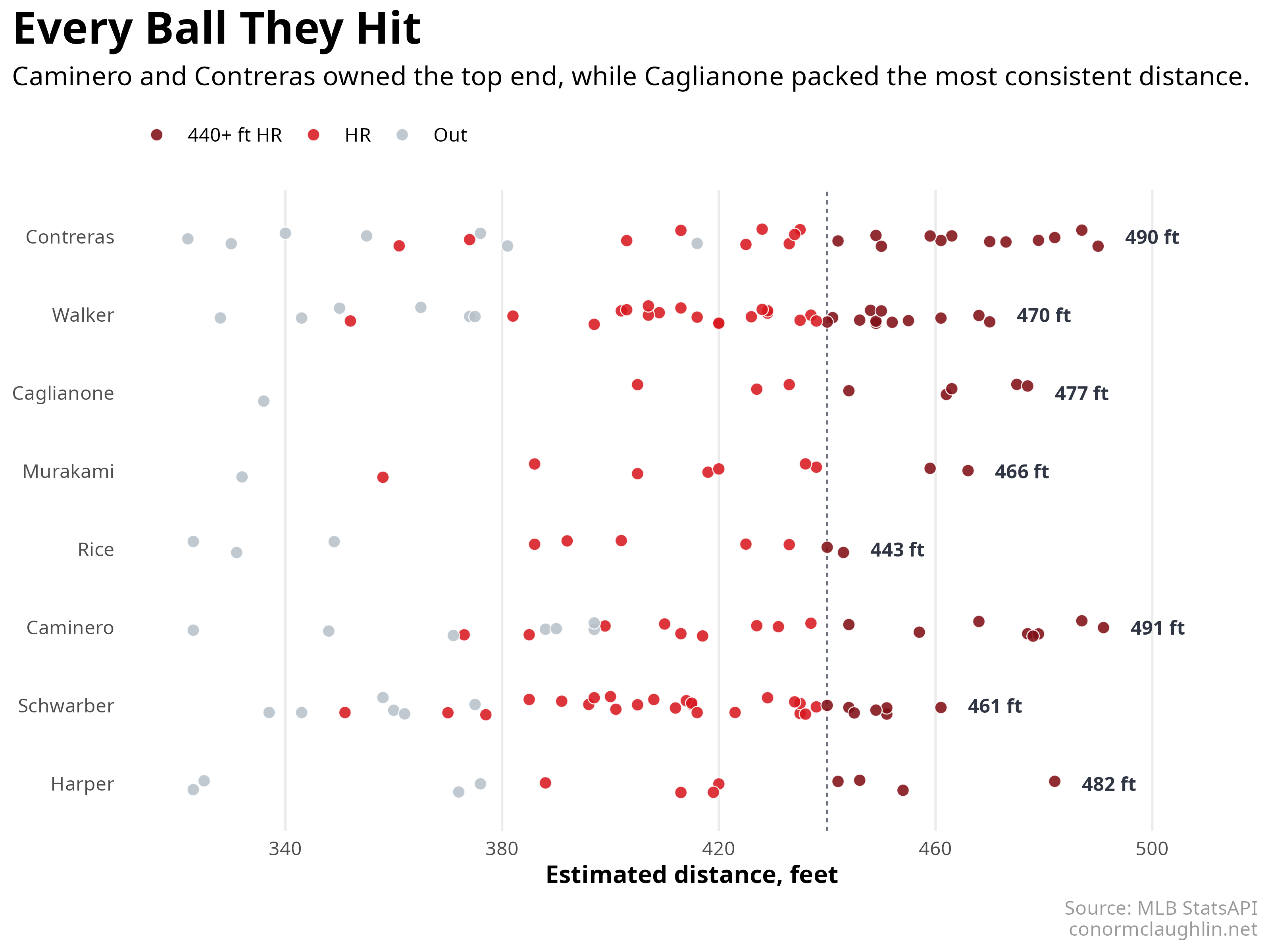
Because the StatsAPI feed also includes distance, launch speed, and launch angle, we can look beyond just whether each swing became a homer and start asking what kind of contact each hitter was making.
This first view shows every tracked ball by hitter, with a line at 440 feet that demarcates where the “long ball” really begins. It’s fascinating to see the distributions per player - I was really surprised by (and impressed with) the distance that Willson Contreras was hitting the ball. I’ve never thought of him as a particularly big or powerful guy… but he was hitting absolute moonshots!
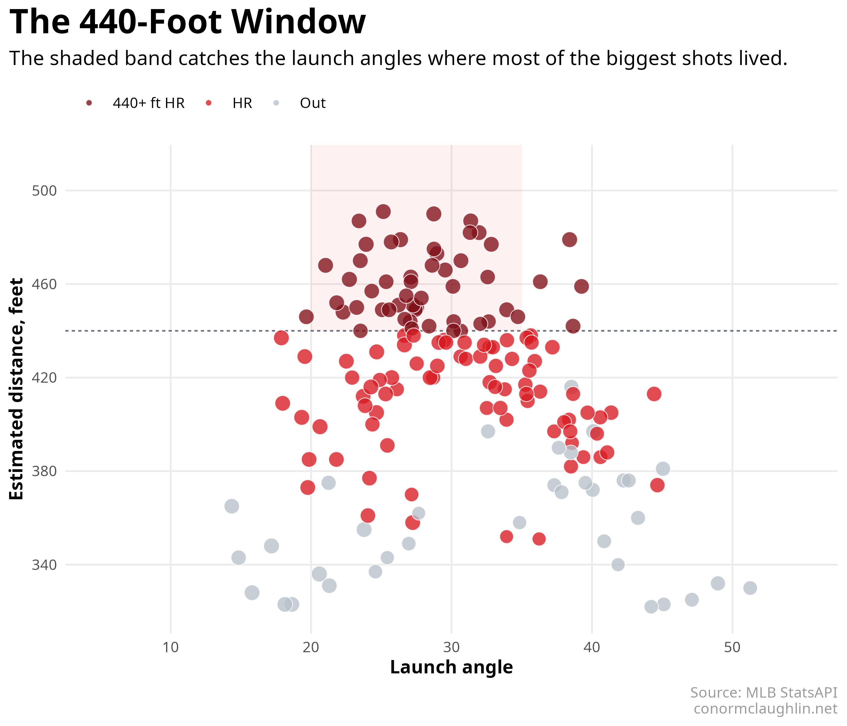
Viewing launch-angle helps enrich our understanding of trajectories - it’s clear that there is a sweetspot in the 20-35 degree range which maximizes distance… you want enough backspin to carry the ball and some loft out of the gate, but not too much.
Code Reference
Here are the base ggplot graphics for the charts I put together - wanted to share in case you find yourself needing to replicate these sorts of views in the future!
Homers vs Outs
plot_hr_vs_outs <- function(round_data) {
  round_data |>
    mutate(
      blast_type = case_when(
        !is_home_run ~ "Out",
        distance >= 440 ~ "440+ ft HR",
        TRUE ~ "HR"
      )
    ) |>
    ggplot(aes(outs_so_far, home_runs_so_far)) +
    geom_path(color = "#aab4c0", linewidth = 0.9) +
    geom_point(
      aes(fill = blast_type),
      shape = 21,
      color = "#9aa5b1",
      stroke = 0.7,
      size = 3
    ) +
    facet_wrap(vars(player_short), nrow = 1) +
    coord_fixed(ratio = 0.6) +
    scale_fill_manual(
      values = c("440+ ft HR" = "#7f1017", "HR" = "#d71920", "Out" = "white")
    ) +
    labs(x = "Outs made", y = "Home runs", fill = NULL)
}
Rhythm
plot_rhythm_strip <- function(round_data) {
  round_data |>
    mutate(
      blast_type = case_when(
        !is_home_run ~ "Out",
        distance >= 440 ~ "440+ ft HR",
        TRUE ~ "HR"
      )
    ) |>
    ggplot(aes(swing_in_round, player_short)) +
    geom_line(aes(group = player_short), color = "#d5dbe3", linewidth = 0.9) +
    geom_point(aes(fill = blast_type), shape = 21, color = "white", size = 3.7) +
    geom_vline(xintercept = 15, linetype = "22", color = "#6b7280") +
    scale_fill_manual(
      values = c("440+ ft HR" = "#7f1017", "HR" = "#d71920", "Out" = "#b7c0ca")
    ) +
    labs(x = "Swing number", y = NULL, fill = NULL)
}
Streak Chart
streak_runs <- swings |>
  arrange(round, player, swing_in_round) |>
  group_by(round, player) |>
  mutate(streak_group = cumsum(!is_home_run)) |>
  group_by(round, player, streak_group) |>
  summarise(
    streak_length = sum(is_home_run),
    start_swing = min(swing_in_round[is_home_run]),
    end_swing = max(swing_in_round[is_home_run]),
    .groups = "drop"
  ) |>
  filter(streak_length > 0)

ggplot(streak_runs) +
  geom_rect(
    aes(
      xmin = start_swing - 0.45,
      xmax = end_swing + 0.45,
      ymin = as.numeric(factor(player)) - 0.32,
      ymax = as.numeric(factor(player)) + 0.32,
      fill = streak_length
    ),
    color = "white"
  ) +
  scale_fill_gradient(low = "#d71920", high = "#5a0b10", guide = "none") +
  labs(x = "Swing number", y = NULL)
Distance Dotplot
distance_data <- swings |>
  filter(!is.na(distance)) |>
  mutate(
    blast_type = case_when(
      is_home_run & distance >= 440 ~ "440+ ft HR",
      is_home_run ~ "HR",
      TRUE ~ "Out"
    )
  )

longest_labels <- distance_data |>
  filter(is_home_run) |>
  slice_max(distance, n = 1, by = player_short, with_ties = FALSE)

ggplot(distance_data, aes(distance, player_short)) +
  geom_vline(xintercept = 440, color = "#6b7280", linetype = "22") +
  geom_point(
    aes(fill = blast_type),
    position = position_jitter(width = 0, height = 0.12, seed = 2026),
    shape = 21,
    color = "white",
    size = 2.4,
    alpha = 0.88
  ) +
  geom_text(
    data = longest_labels,
    aes(x = distance + 5, label = paste0(round(distance), " ft")),
    hjust = 0,
    fontface = "bold"
  ) +
  scale_fill_manual(
    values = c("440+ ft HR" = "#7f1017", "HR" = "#d71920", "Out" = "#b7c0ca")
  ) +
  labs(x = "Estimated distance, feet", y = NULL, fill = NULL)
Launch Angle vs Distance
ggplot(distance_data, aes(launch_angle, distance)) +
  geom_hline(yintercept = 440, color = "#6b7280", linetype = "22") +
  annotate(
    "rect",
    xmin = 20,
    xmax = 35,
    ymin = 440,
    ymax = Inf,
    fill = "#d71920",
    alpha = 0.06
  ) +
  geom_point(
    aes(fill = blast_type, size = launch_speed),
    shape = 21,
    color = "white",
    alpha = 0.78
  ) +
  scale_fill_manual(
    values = c("440+ ft HR" = "#7f1017", "HR" = "#d71920", "Out" = "#b7c0ca")
  ) +
  scale_size_continuous(range = c(1.6, 4.2), guide = "none") +
  labs(
    x = "Launch angle",
    y = "Estimated distance, feet",
    fill = NULL
  )